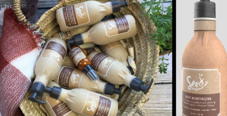
Project Overview:
In this project, we experimented with “informational packaging” that seeks to provide users and consumers with more detailed information about the product beyond just its branding elements and basic features. We based our design on what a line of curly hair products would look like from the company Native. The design features a breakdown of the product’s ingredients and their values as well as directions presented visually and intuitively.
Group Roles:
All group members worked together on collecting visual inspiration, ideation of products, general research, sketches, presentations, and the creation of the final deliverables. Group members had the following roles:
Mekayla: box template, box design, assembly of the box, research on current Native packaging
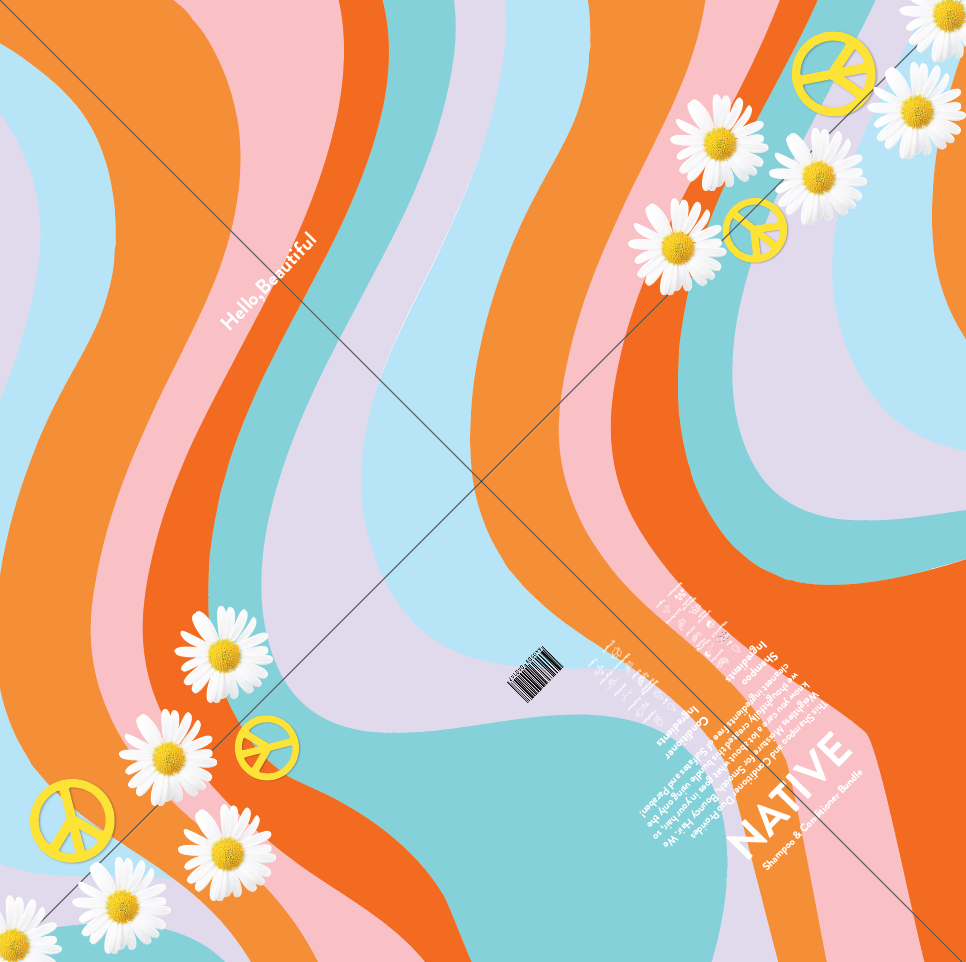
Mariam: brand color scheme, the graphic on the front, assembly of the conditioner bottle
Brianna: bottle templates, research on materials, directions, icon designs, assembly of the shampoo bottle
Tools Involved:
Adobe Illustrator & Miro
Context:
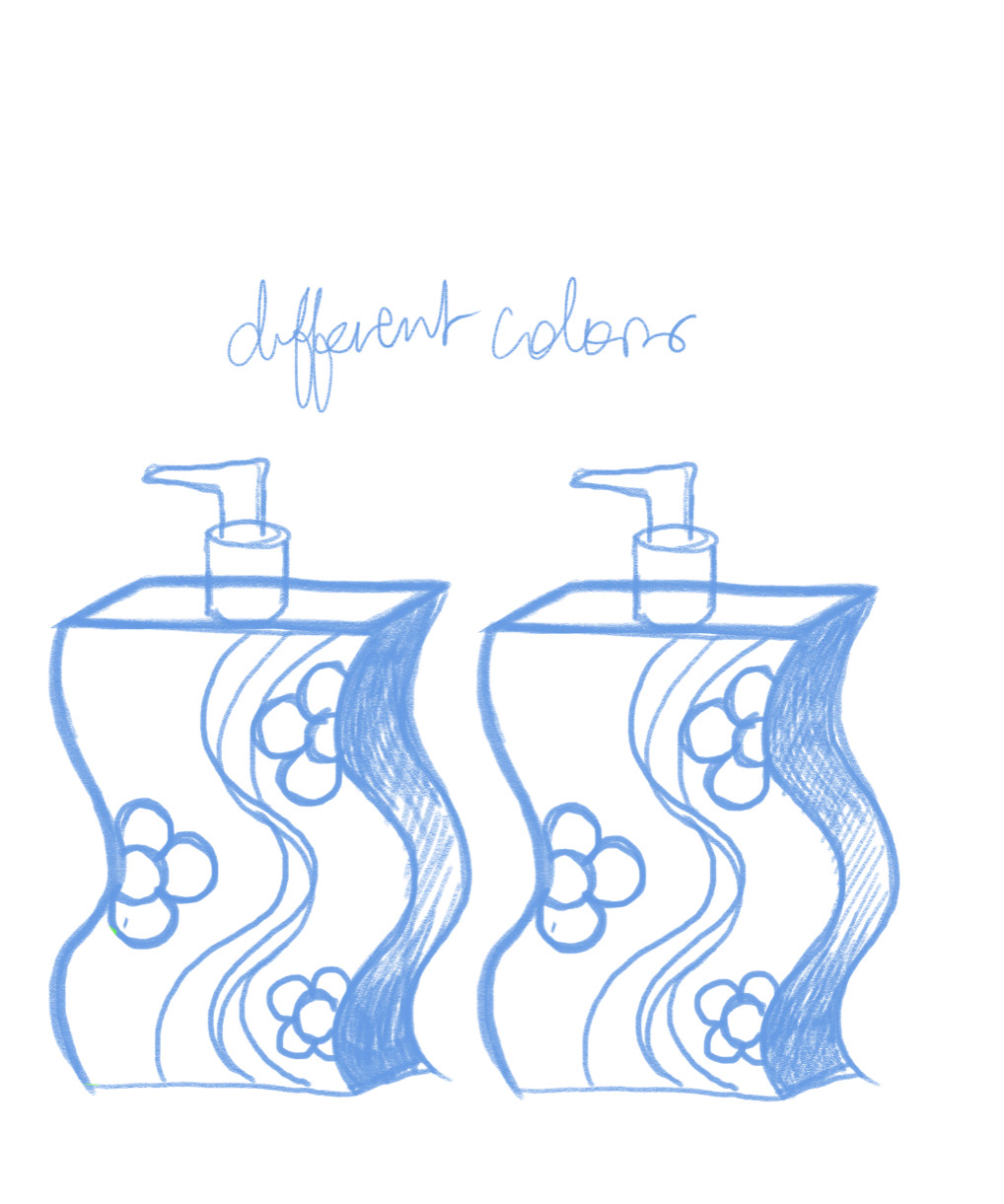
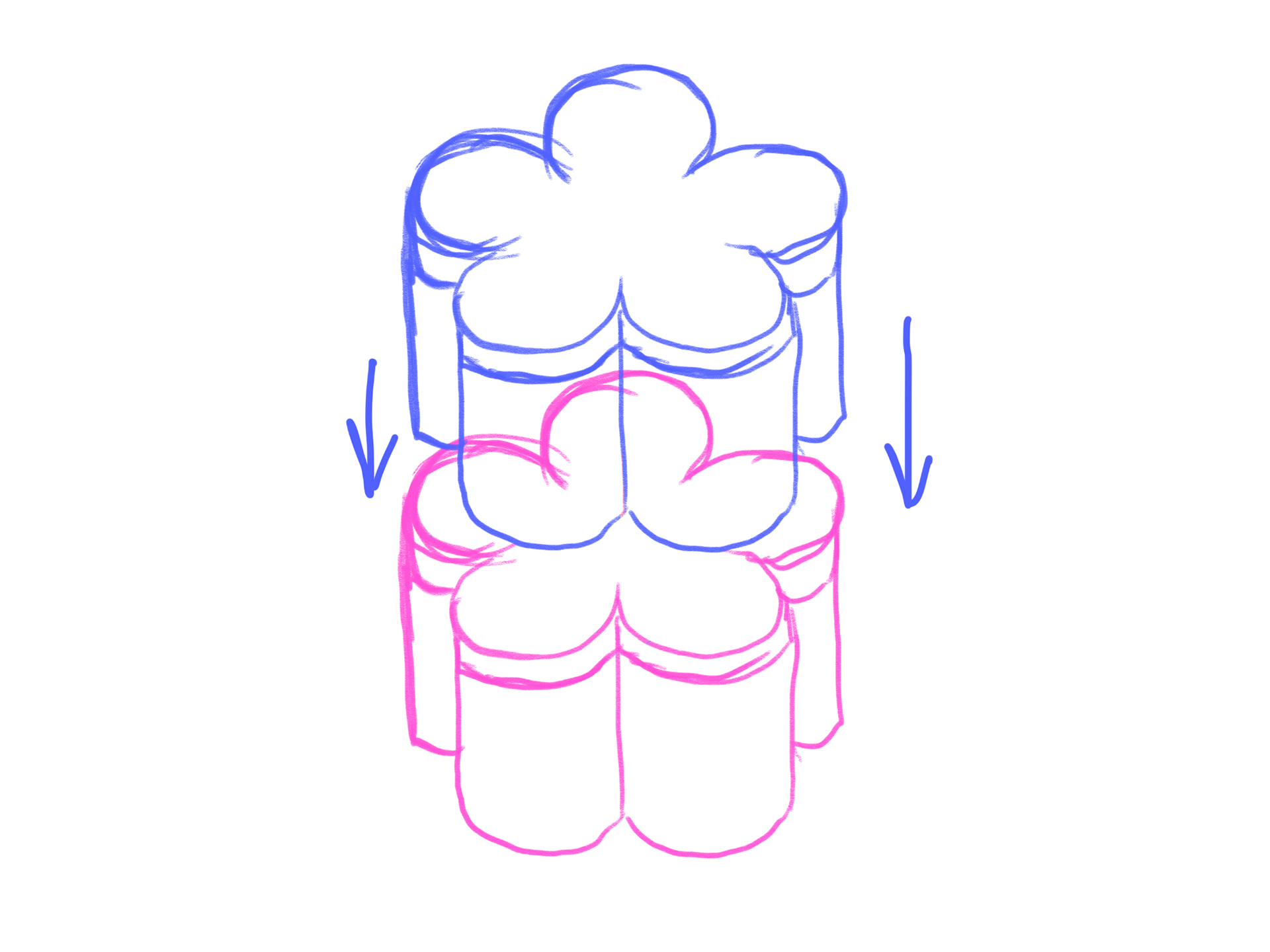
The key users and stakeholders for this product would be individuals trying to gain control of their curly hair. They are conscious of what they consume and find their current shampoos and conditioners contain harmful sulfates, parabens, and silicone which strip their hair of moisture. They value clean and simple ingredients and need clear instructions on how to care for their curls. Hair products can also take up a lot of space in the bathroom, which can lead to disorganization and frustration. We decided to create a bundle of shampoo and conditioner from a possible line of curly hair products from the company Native that includes a breakdown of the simple ingredients as well as clear instructions on how to revive their curls. Our shampoo and conditioner bottles also mimic the form of a curl and fit together to save space. Life is hard enough, understanding ingredients and taking care of your hair should not be.
Process:
Our process began with a team ideate session. We started by collecting visual inspiration of unique informational packaging design on Pinterest and the web and talked about what stood out to us. We all felt drawn to skincare and hair packaging since there is a lot of information that could be conveyed. We also liked the idea of doing a value pack of 2 products.
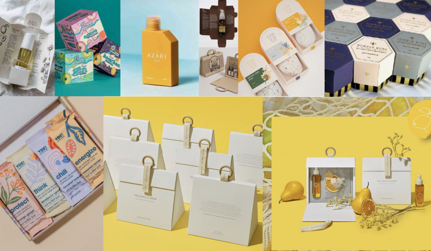
We created a pitch to present two packaging ideas to our class and get feedback. Our first idea was a stackable skincare product for easy storage and travel. The target users would be individuals interested in skincare with limited space and that are constantly on the go. Our second idea was a hair care value package complete with shampoo and conditioner that is targeted towards individuals with curly hair who need a product catered to their needs. Both ideas would need to include information such as the brand identity, mission statement, ingredients, instructions, amount of product, distribution centers, barcodes, and key statements such as "vegan" and "cruelty-free".
Mariam Bottle Sketch
Stackable Skincare Sketch
Skincare Sketch 1
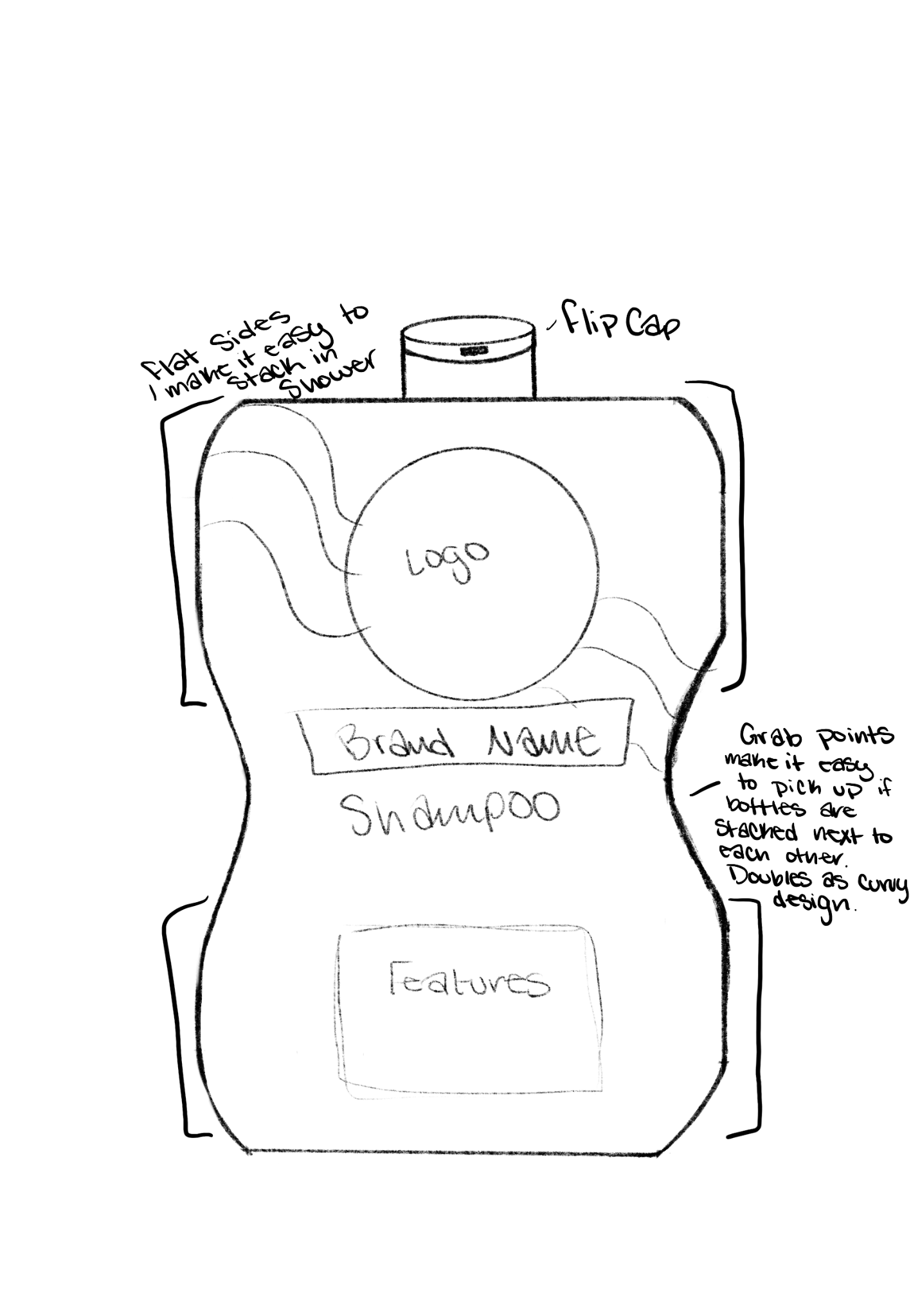
Mekayla Bottle sketch 1
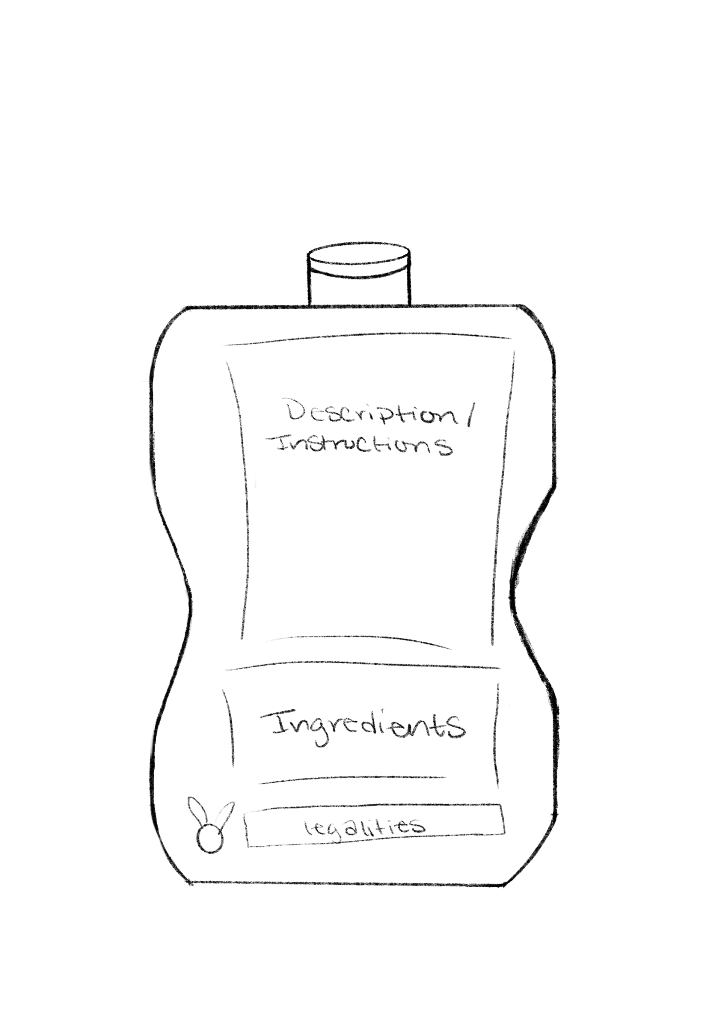
Mekayla Bottle Sketch 2
Brianna Bottle Sketches
Brianna Box Sketch
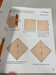
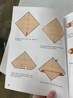
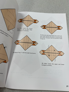
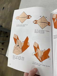
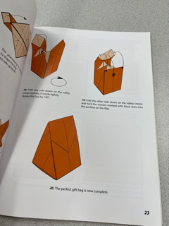
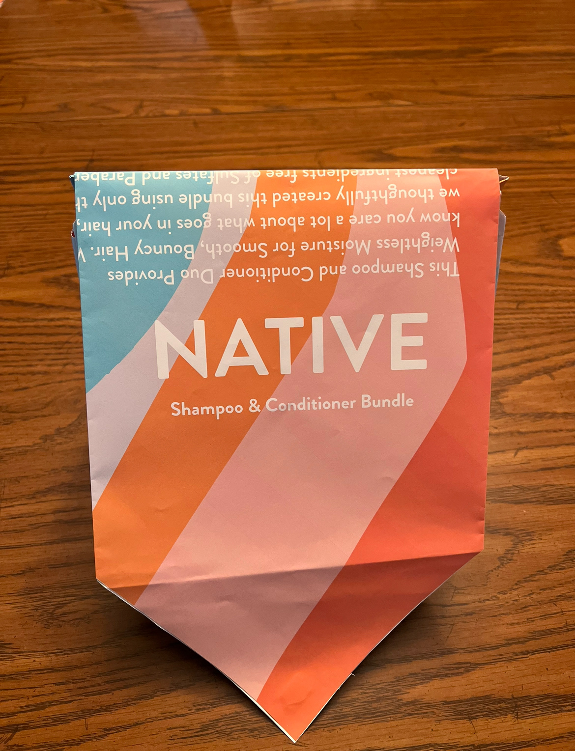
After the pitch, we decided to move forward with the haircare value pack. Classmates recommended that we take an already existing brand with few ingredients instead of trying to create our own brand from scratch. In addition, our group took a visit to Thompson Library at The Ohio State University and learned about the history of origami. This gave us a lot of ideas on how to move forward with the project and we found a template for the bag in which our shampoo and conditioner would be placed.
Our next step was to collect research on a current brand. We decided to choose to create a line based on the company Native, as they have clean and simple ingredients that would appeal to our target audience. Our goals and objectives for this project were to (1) make an ingredient list that is transparent and informative, (2) create clear directions for use, (3) make a visual and eye-catching product that will stand out on busy shelves, and (4) create a bottle shape that stacks together with one another. We also defined our target audience with the persona of Ashley. Ashley is 26 years old and is trying to gain control of her curly hair She is becoming more conscious of what she consumes and has found that her current shampoo has a lot of sulfates, parabens, and silicone that are stripping her hair of moisture causing her to lose her curls. She is looking for a simple solution to regain her curls. She values clean ingredients and sustainability and wants clear instructions to understand how to care for her dry, frizzy, curly hair.
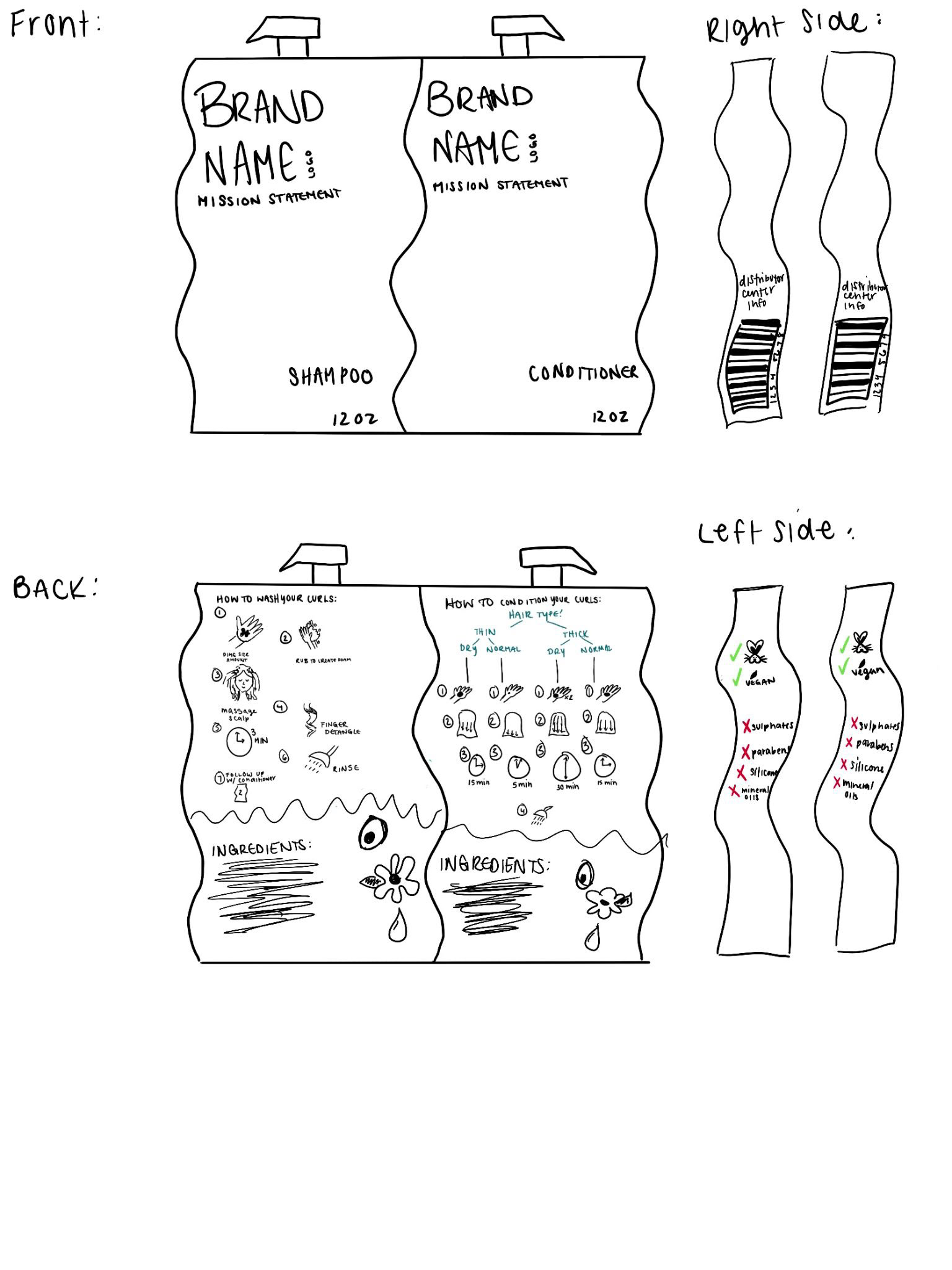
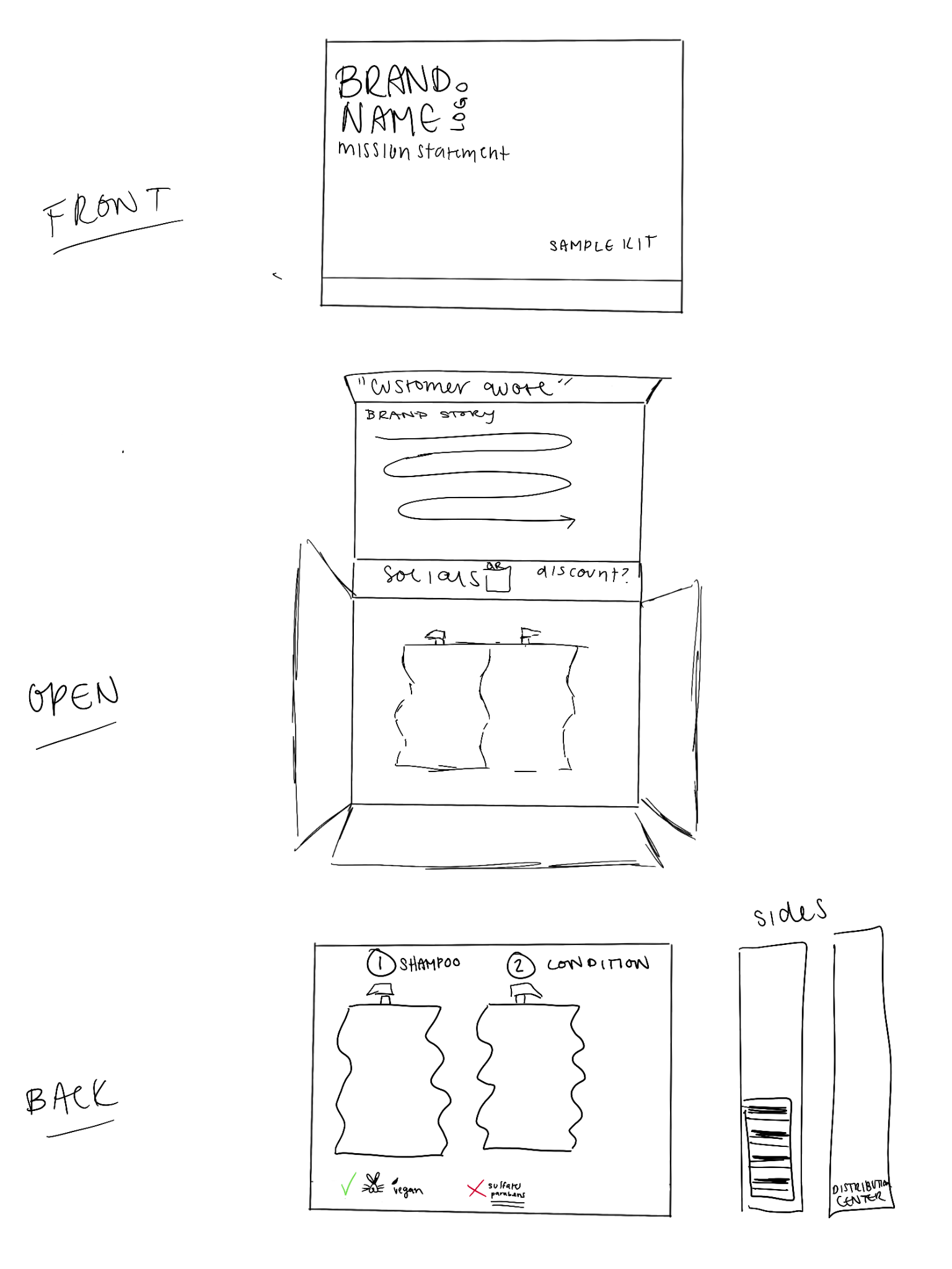
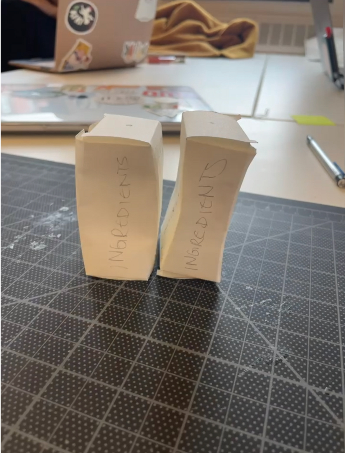
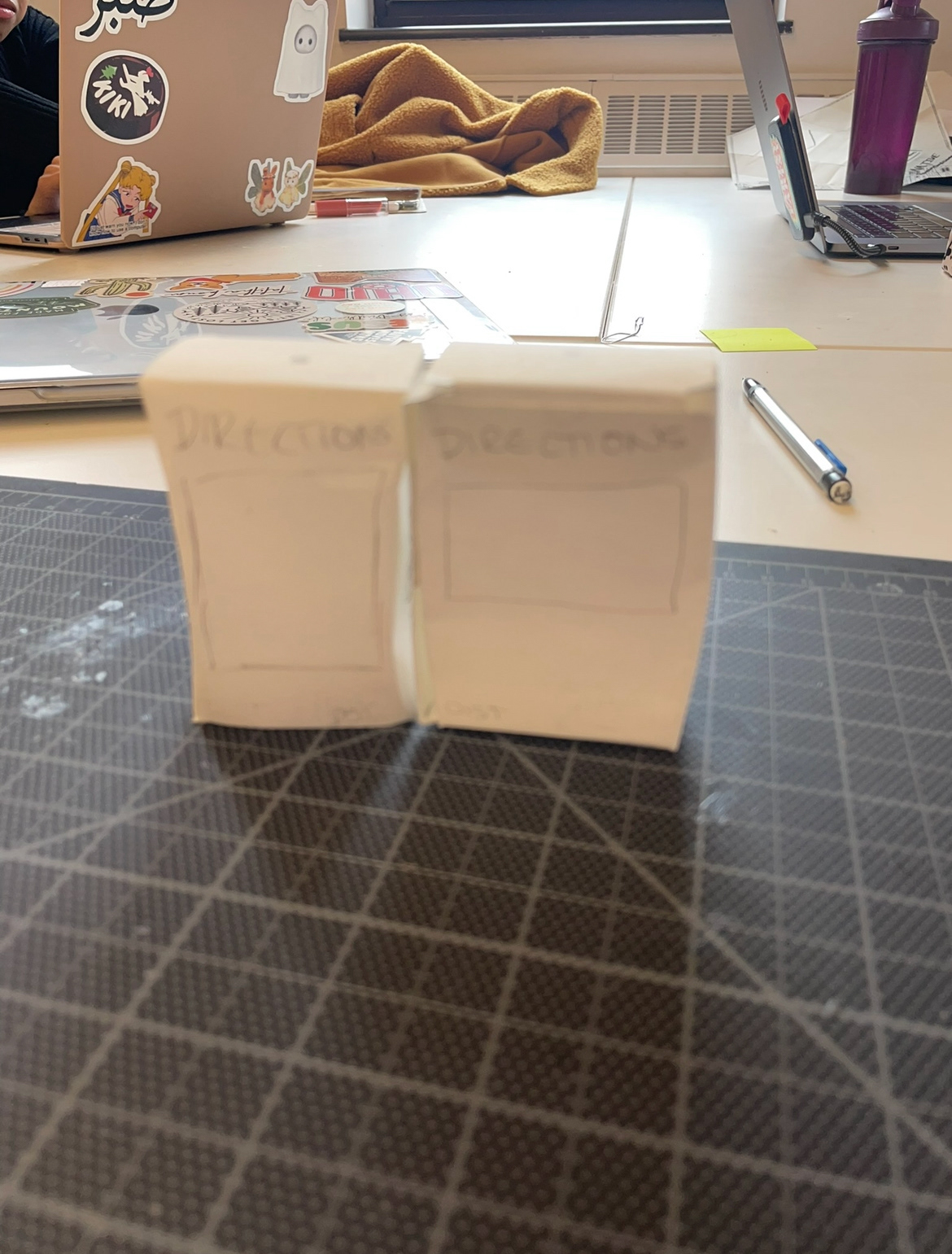
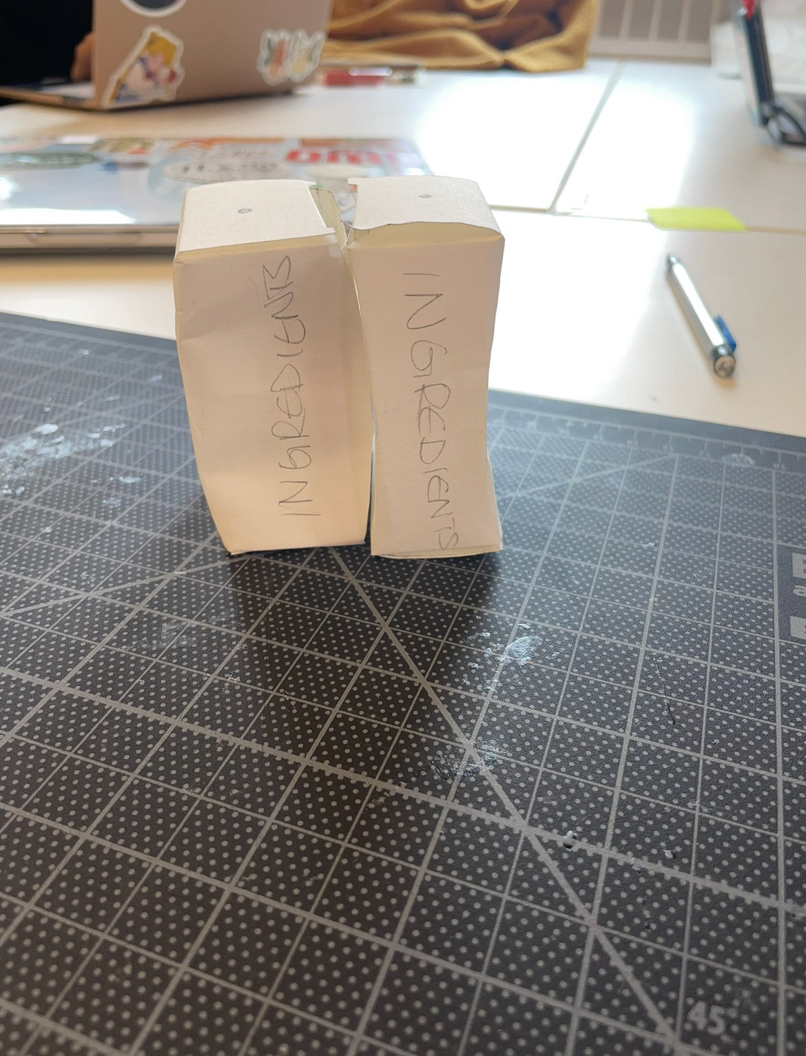
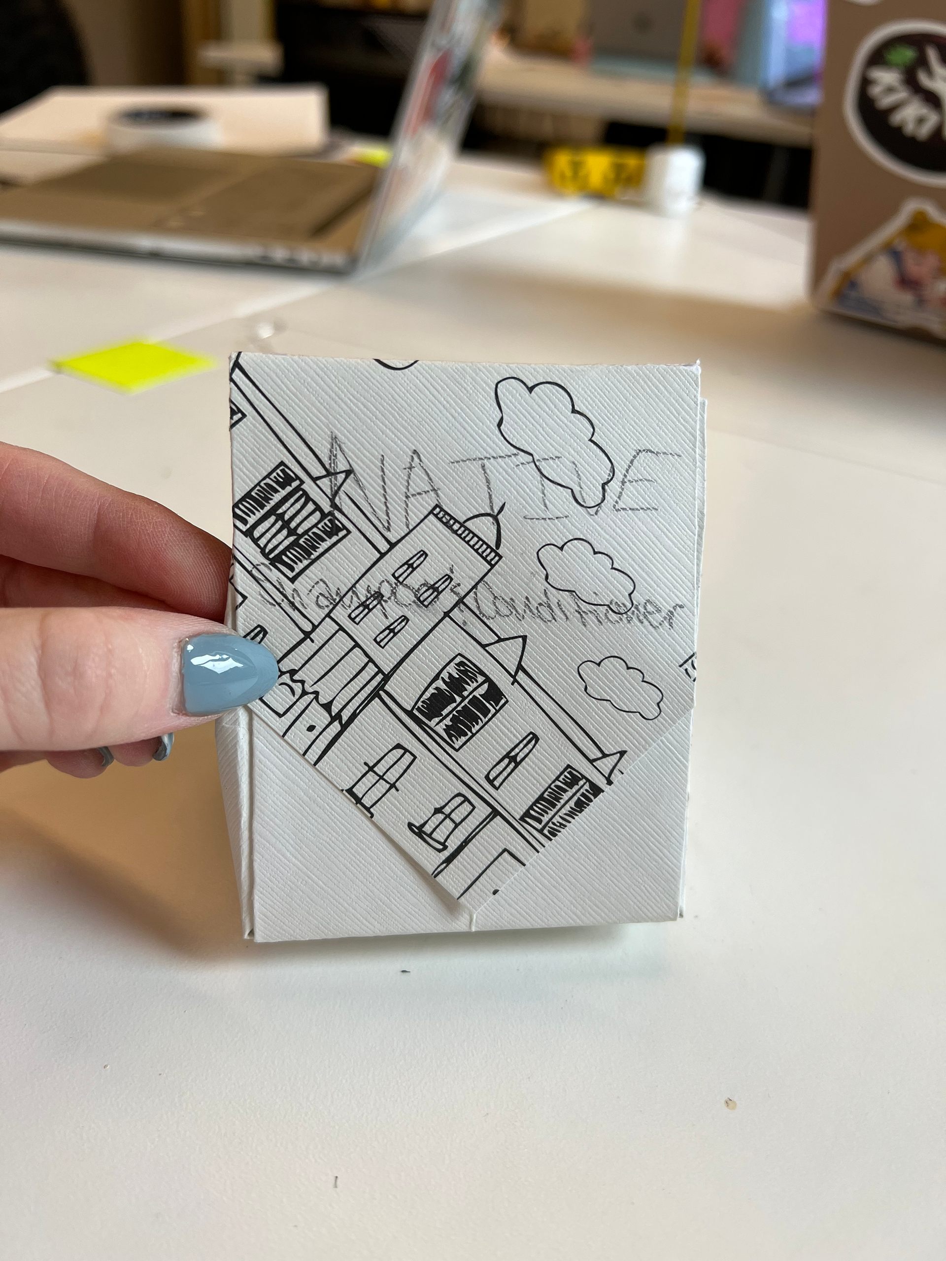
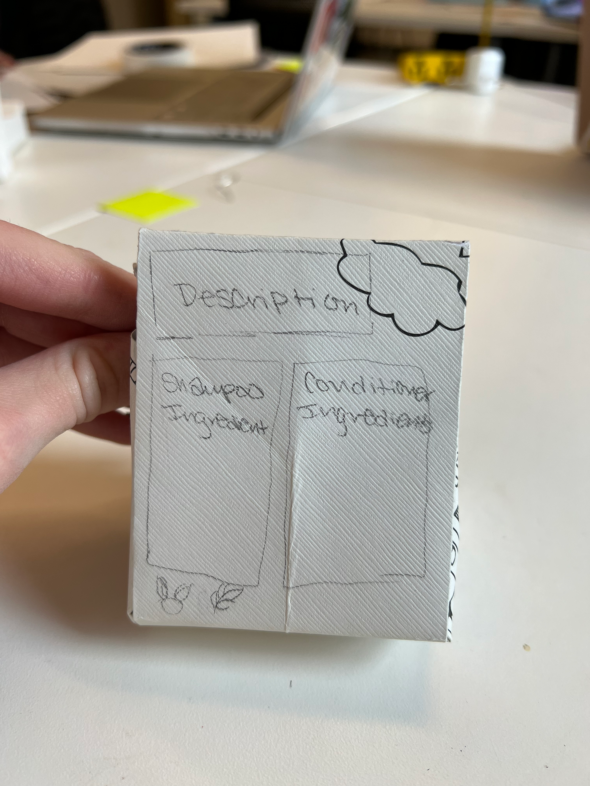
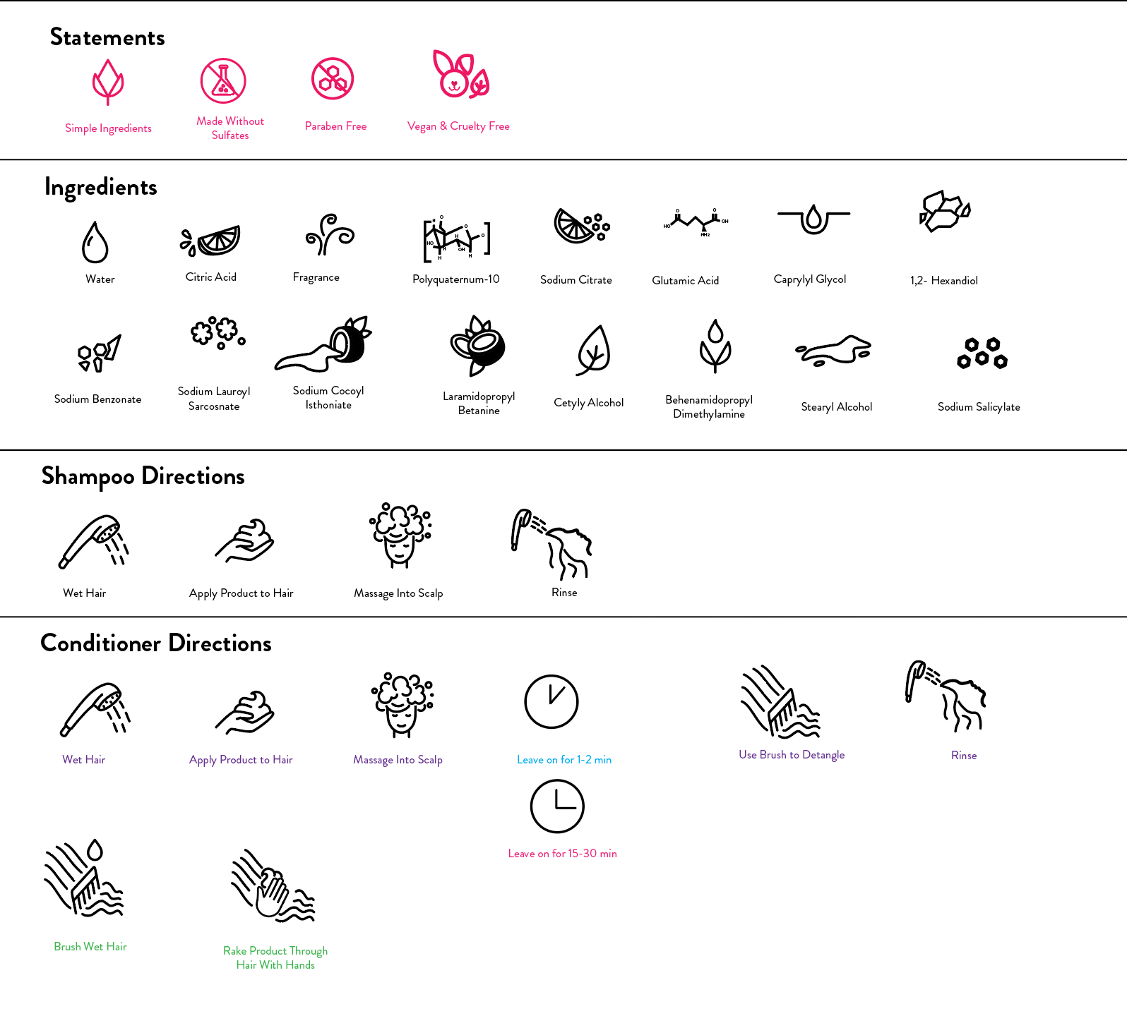
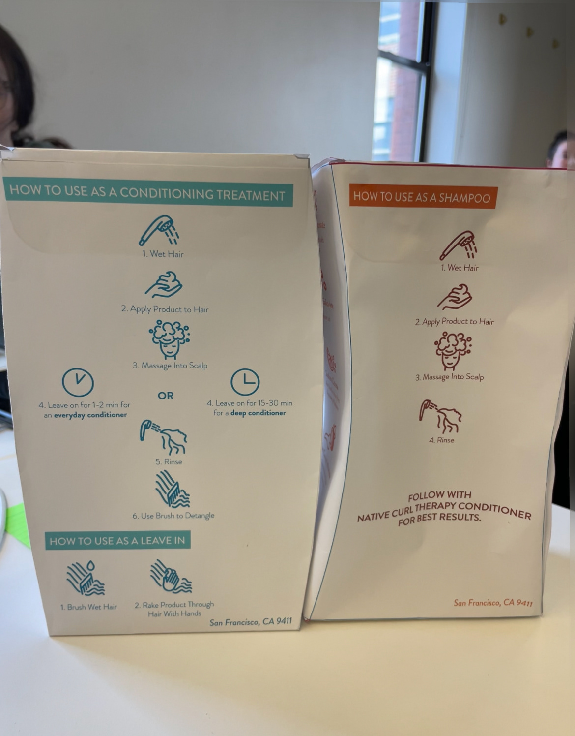
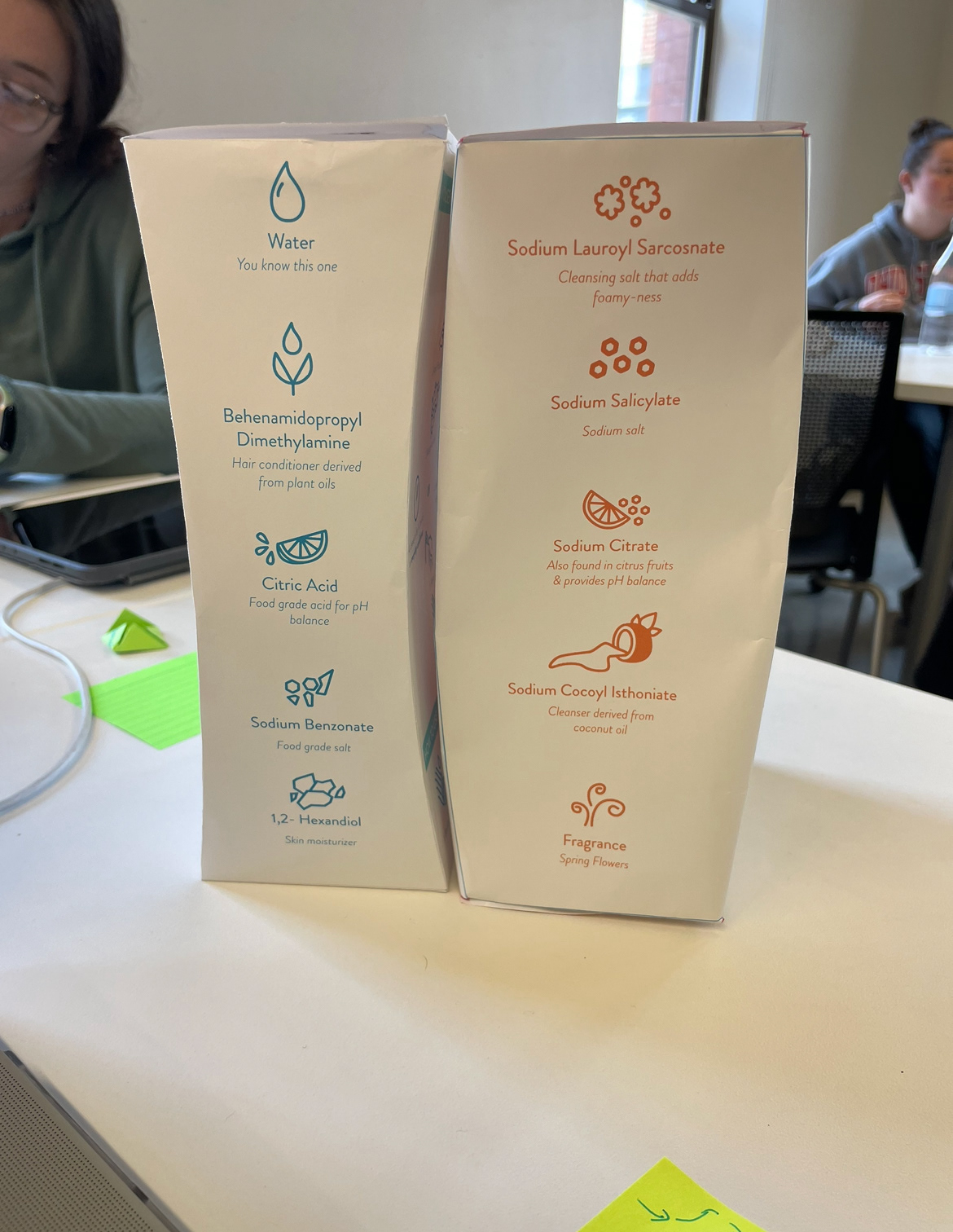
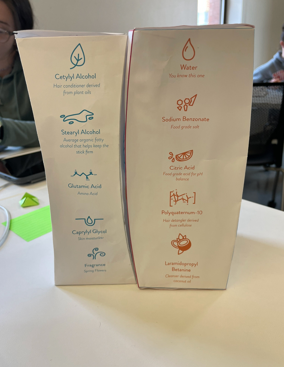
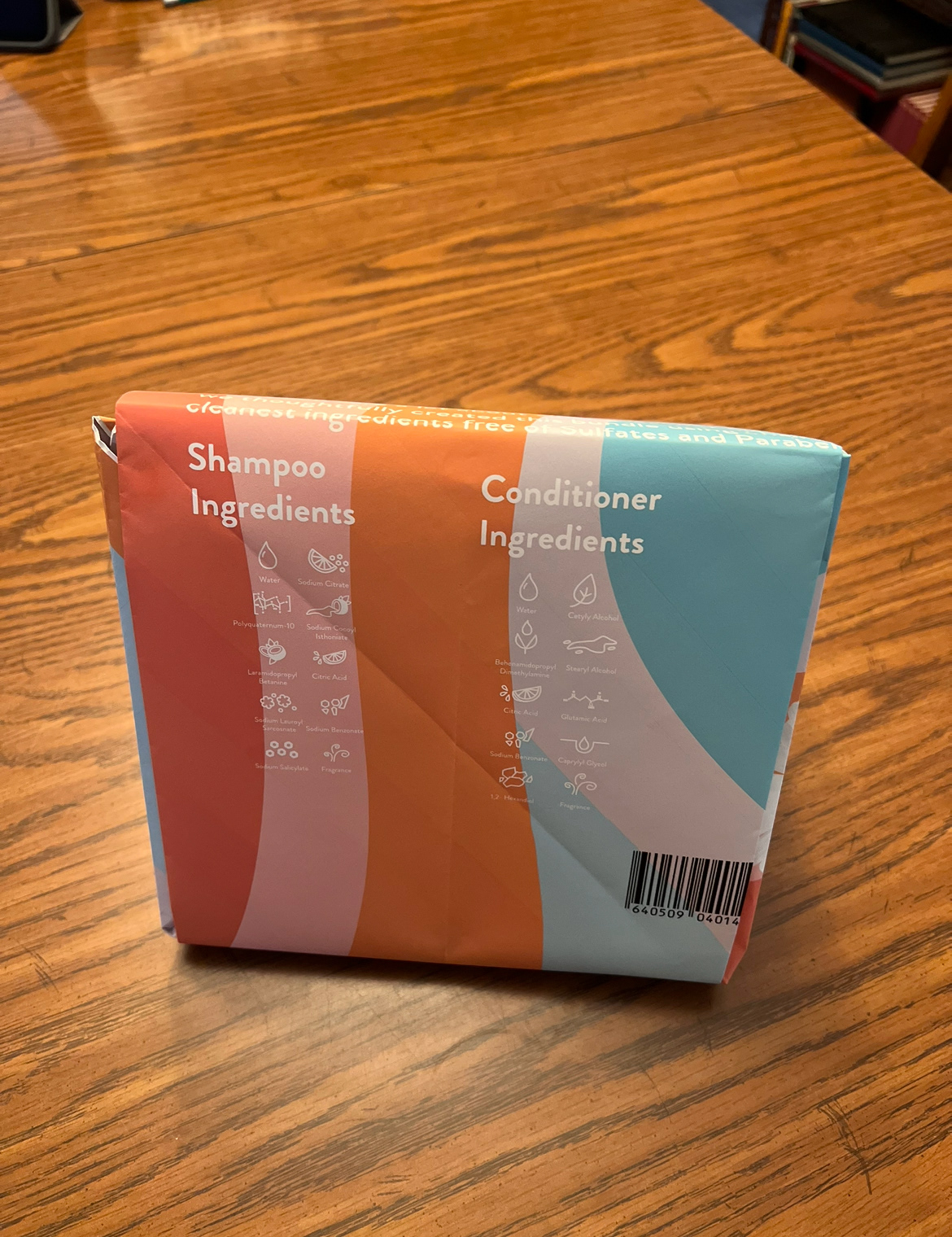
In terms of the information being conveyed, on the outside of the bag we wanted to include the products (shampoo and conditioner), key statements (silicone free, sulfate free, paraben free, vegan, and cruelty free), distribution center (San Francisco, CA 9411), barcode, and the volume of the products (2 16.5 fl oz.). On the bottles we wanted to convey the key statements again, the distribution center, volume, the ingredients (10 for each bottle), and the instructions for both bottles.
In terms of materials, we only had cardboard, cardstock, paper, and adhesive to build a prototype. However, in terms of ideal materials, we would like to create a sustainable shell made of water-resistant paper fibers mixed with mineral components bonded with heat and pressure similar to a bottle created by L’oreal. There would be a rigid polymer liner made of 80% post-consumer recycled high-density polyethylene (HDPE) that is recyclable. It would also include paper labels as well as a packet of seeds inserted between the liner and the shell.
In class, Brianna and Mekayla worked on prototyping the bottles and the outside bag, while Mariam worked on finalizing the branding details. From there, Brianna and Mekayla were able to create the templates on Illustrator and share the documents with the group. Brianna created icons for the ingredients and directions as well that matched the ones that Native already had so they could be used on the bottles. In terms of feedback from classmates, it was recommended that we make the front graphic smaller for the final critique day in class.
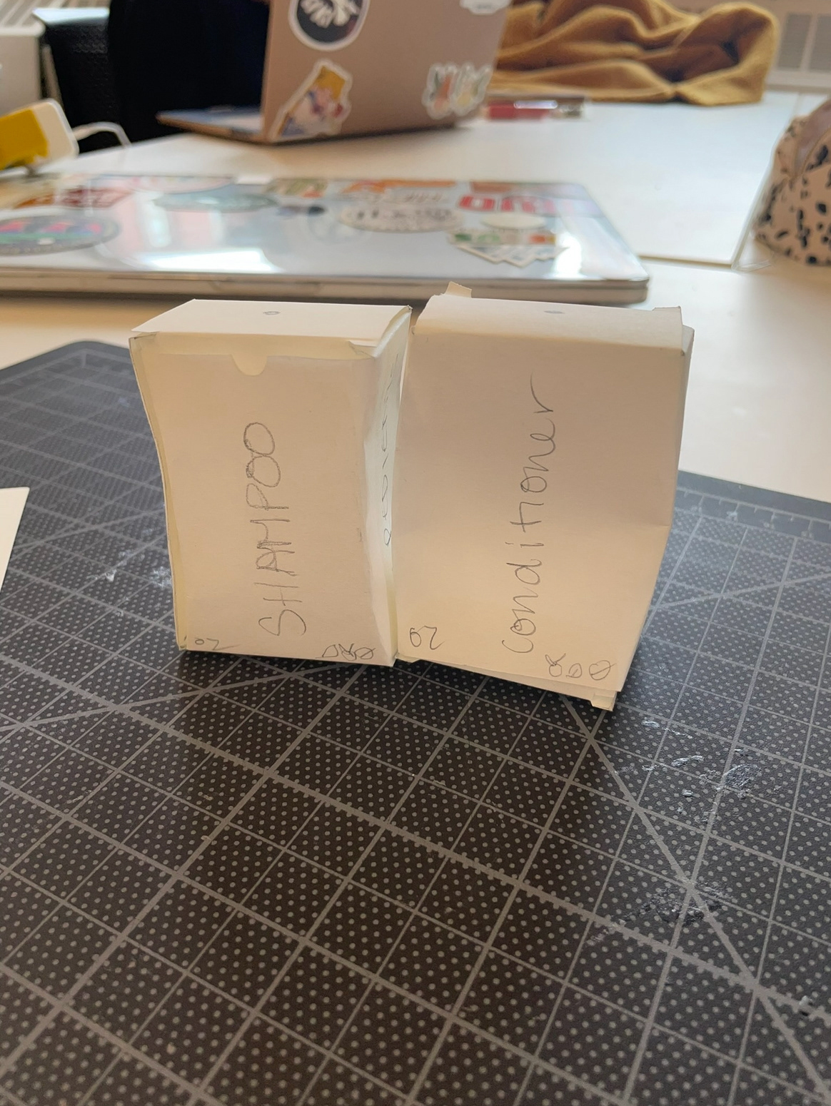
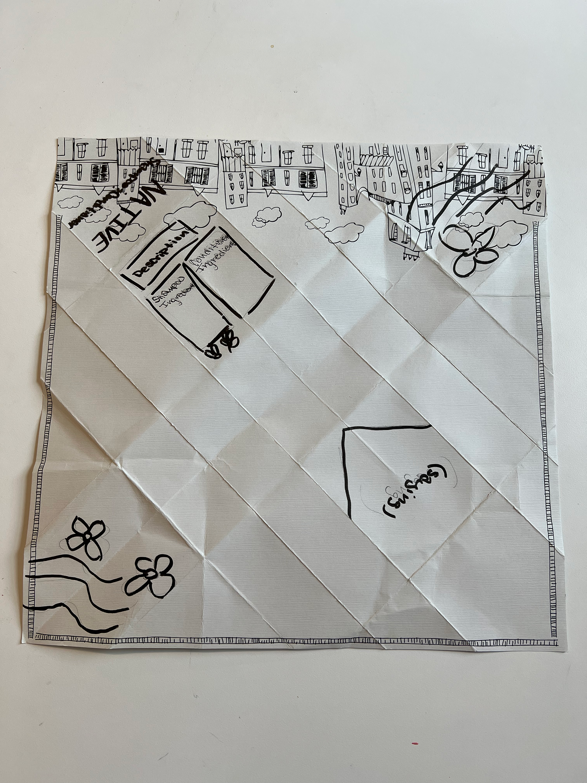
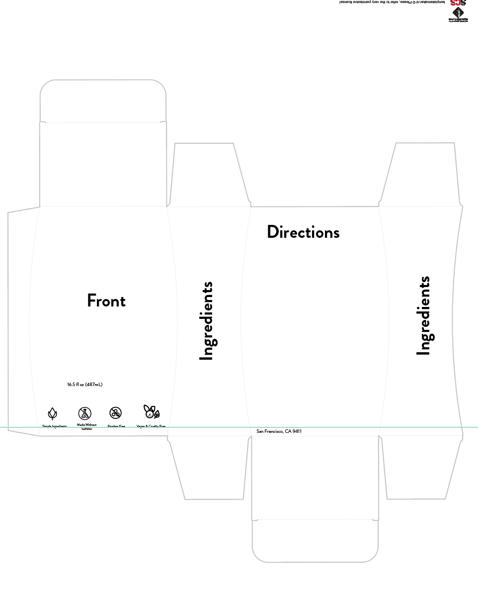
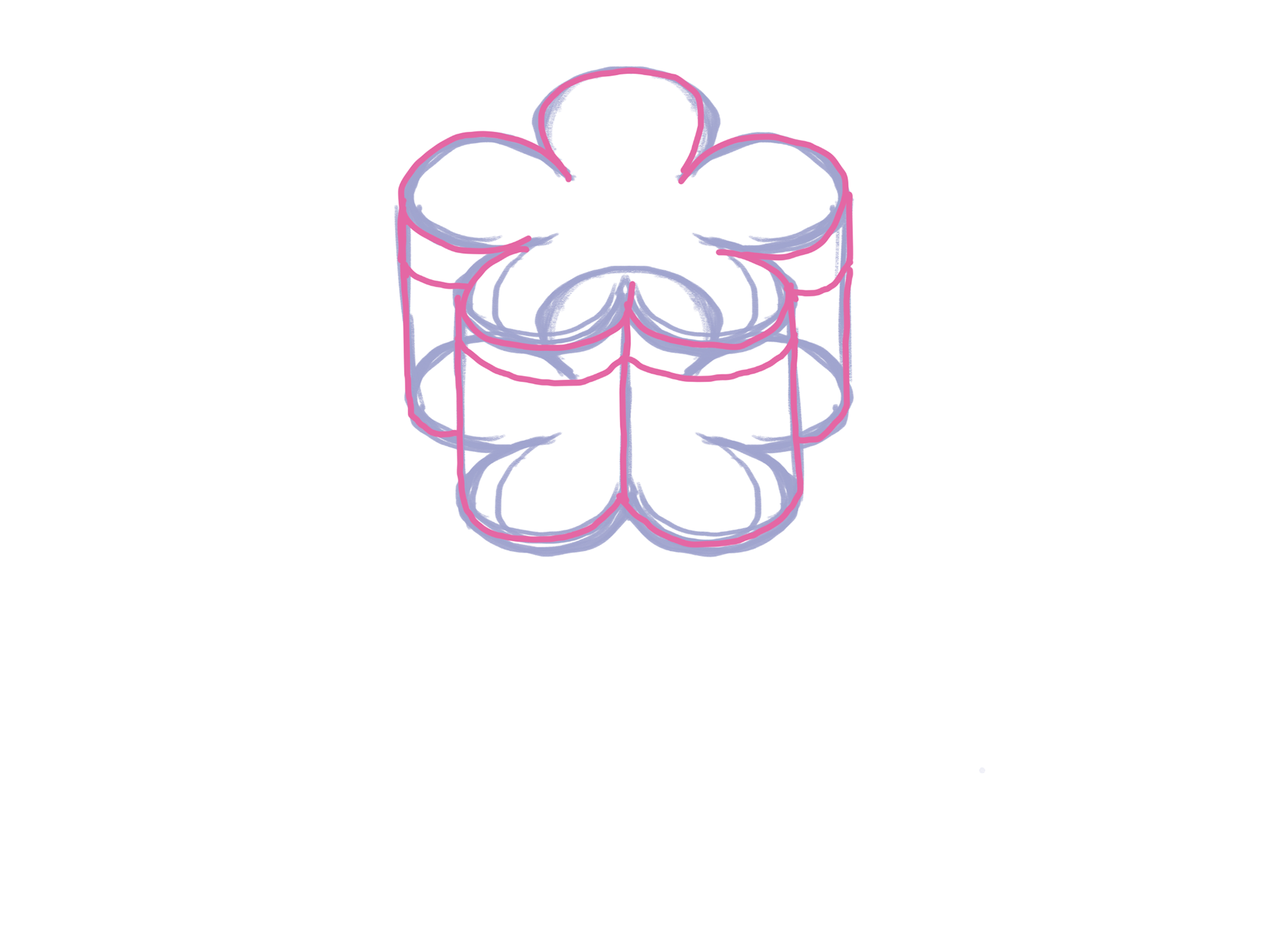
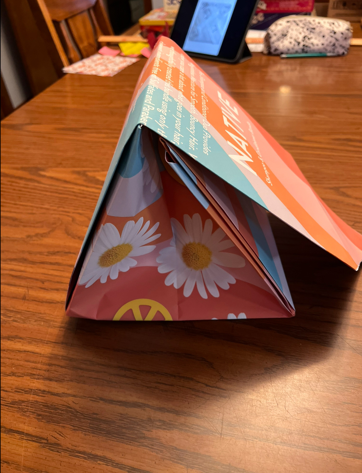
For the final critique day, we presented our printed prototypes. When printed and assembled, our bottle prototypes worked together, however, the bag did not print right. Therefore, we decided to pivot to a box to place the bottles in. Some feedback that we got was to center the text, make the graphics on the bottles connect, place the instructions into a circular pattern with arrows instead of a linear format, and add cardboard/ cardstock to make the prototype more sturdy.
For more process details visit our miro link: https://miro.com/app/board/uXjVPhXn3ZQ=/?share_link_id=794549906656
Final Deliverable
For the final deliverable, we took the feedback that we received in class and placed the instructions in a circular pattern. We also added graphic elements to connect the bottles and tried to make the physical prototypes more supportive.
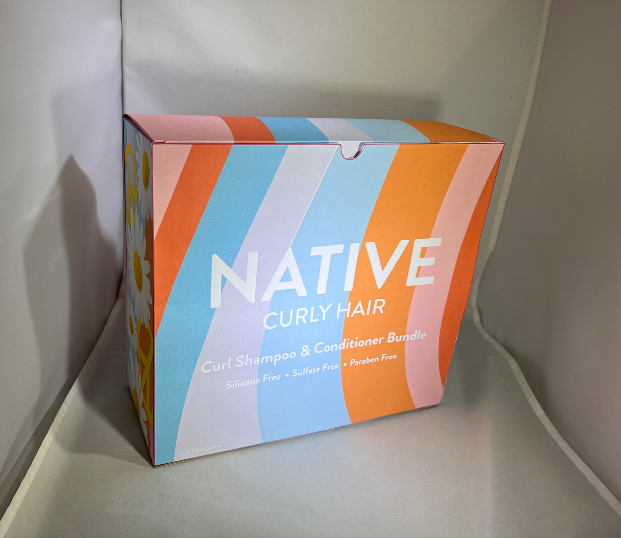
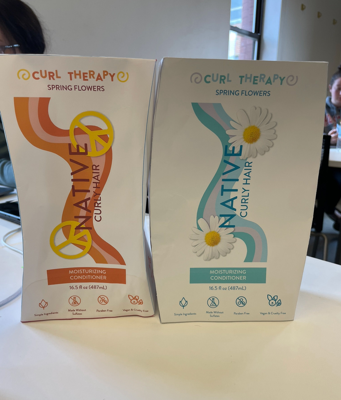
Box front
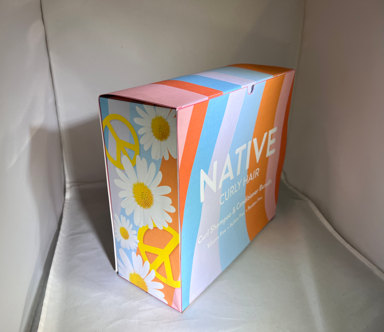
Box Angle
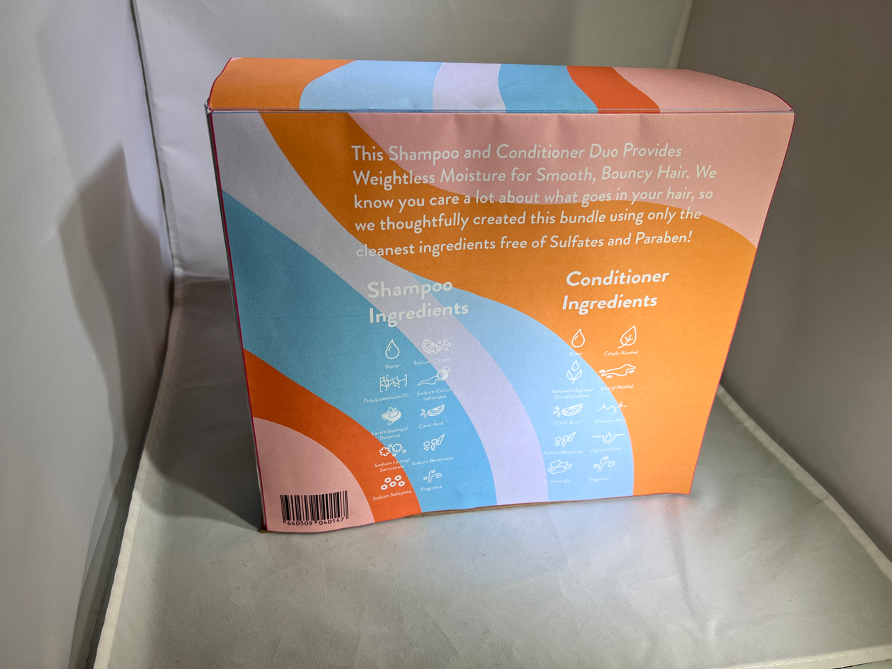
Box back
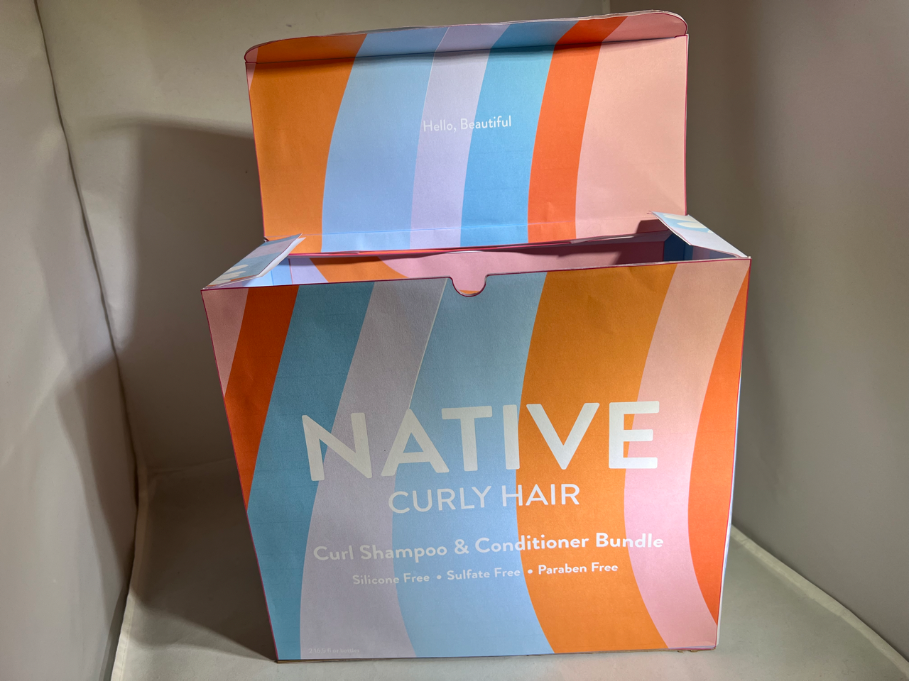
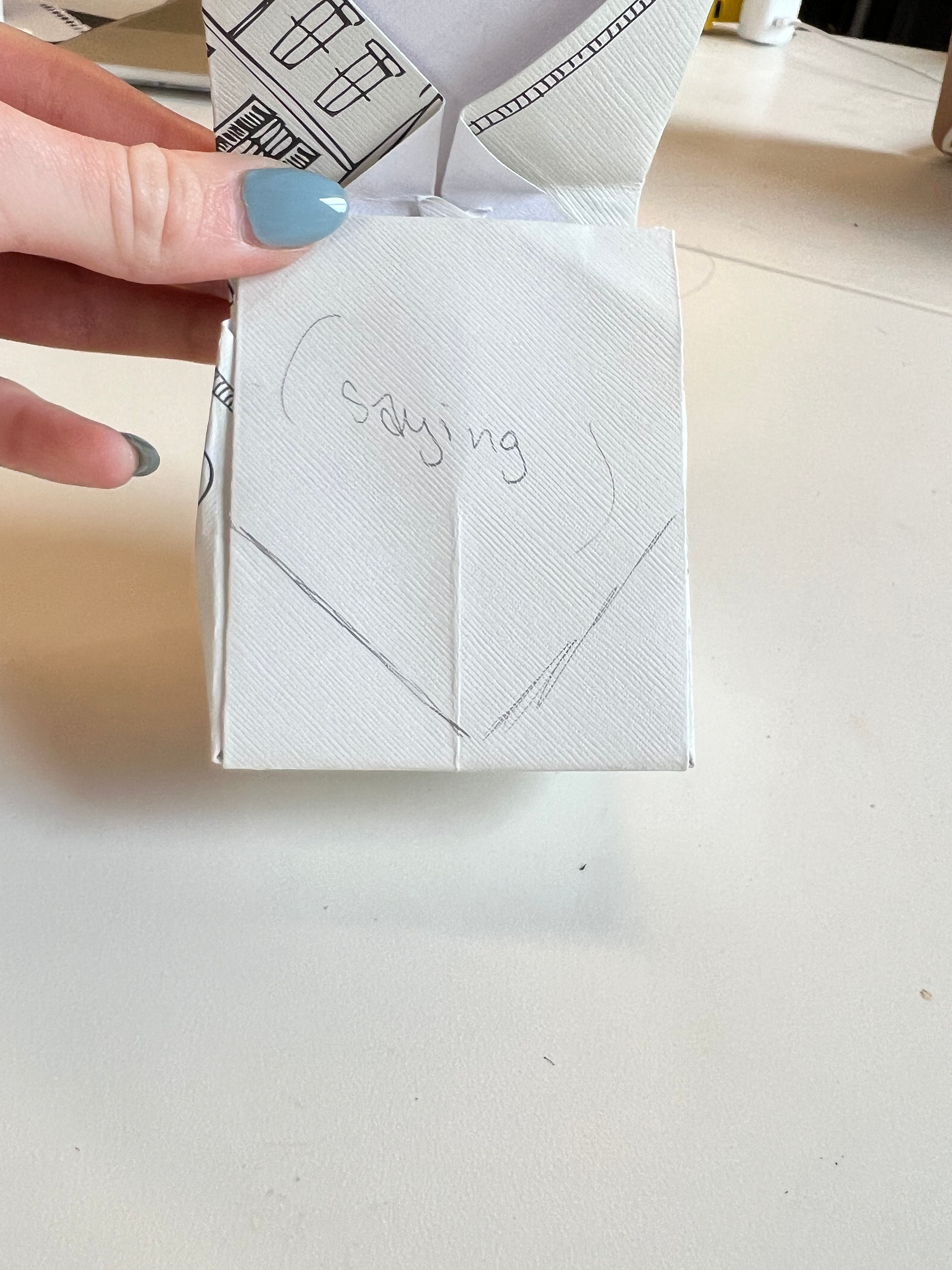
Box front open with message
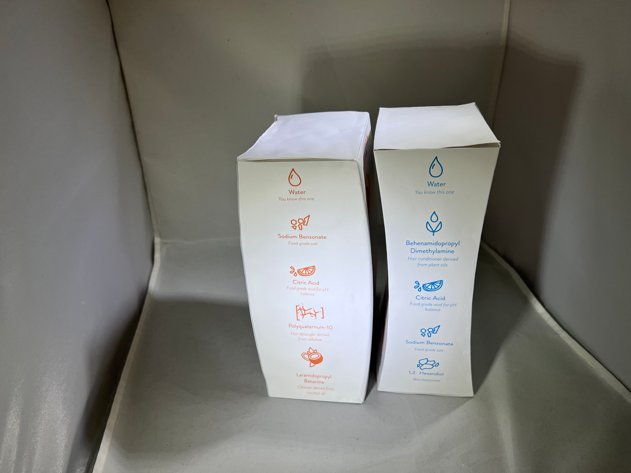
Bottles side 1
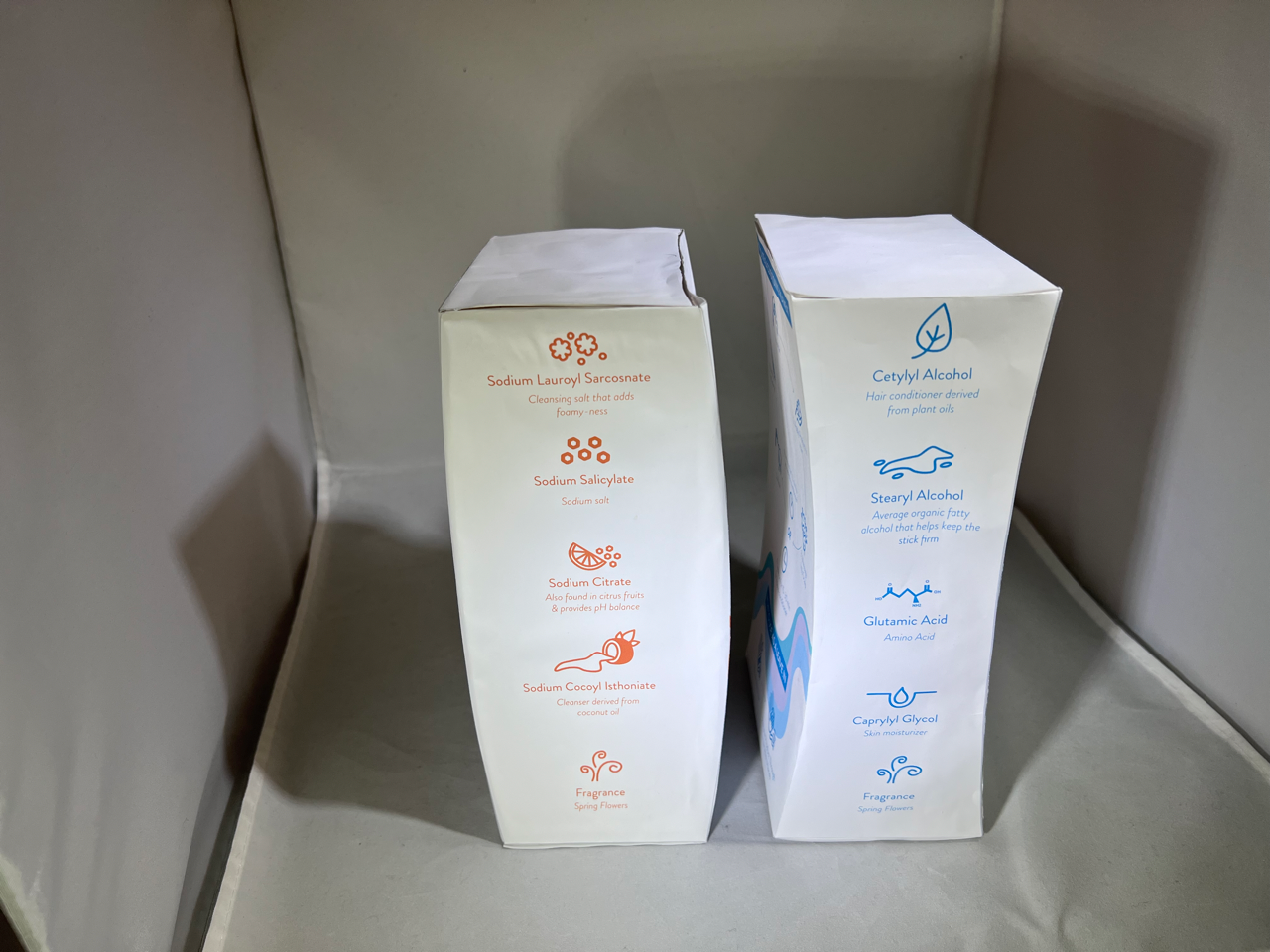
Bottles side 2
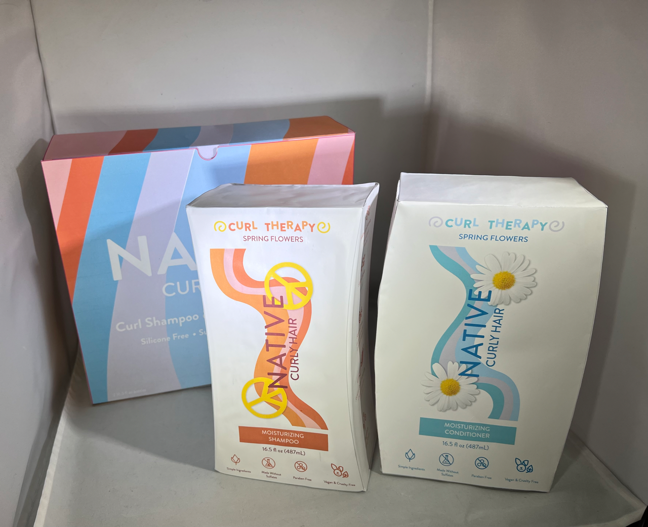
All products
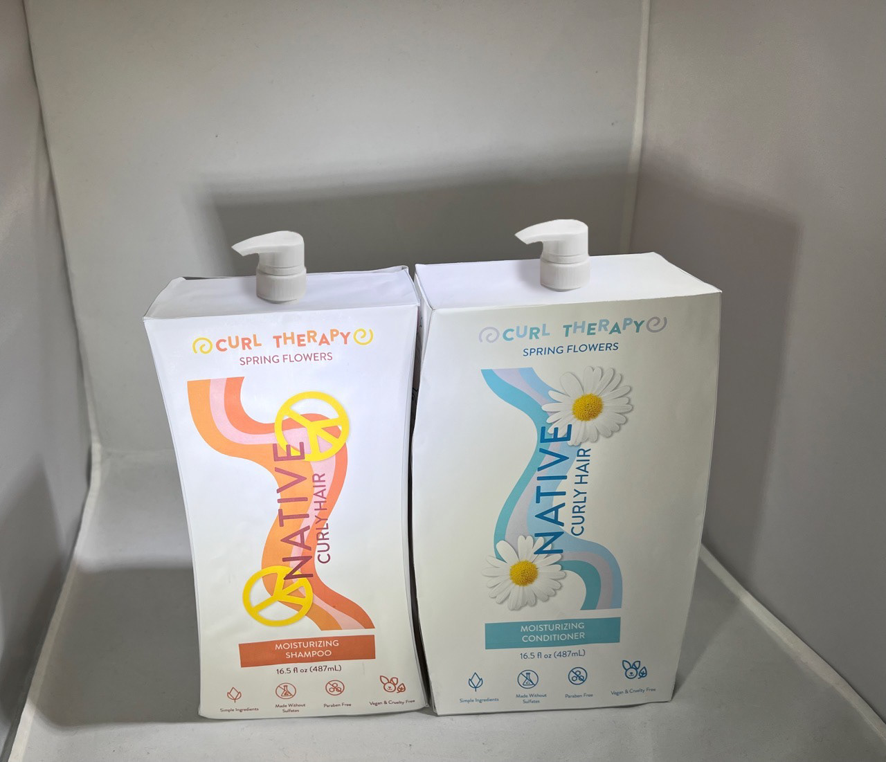
Bottles front with pumps
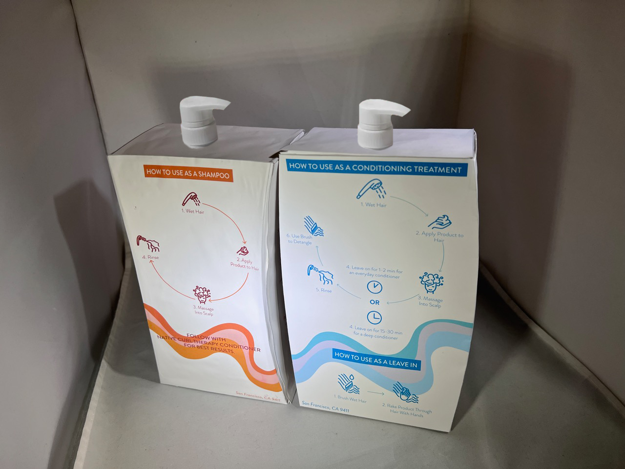
Bottles back with pumps
Reflection
This was a great project to see how data can be visualized in a 3D context, as most of the products for visual communication design students are solely 2D. We as consumers are constantly surrounded by packaging, so it was fun to explore designing our own informational packaging design. One of the most challenging parts of this project was making the new ingredient and instruction icons match the existing icons and branding. Another challenging part was making sure that the prototypes printed and were executed well. We had to pivot from our original vision of the bag, as it was not printing and folding right. Although we all liked the box that was created in the end, it would also have been nice to see what the bag would have looked like if we had more time. Another improvement we wish for would be the execution of the final prototype. The glue that was used for the shampoo bottle made the prototype wrinkly and look unpolished despite taking over an hour to construct with precise measurements with an X-Acto knife. It would be interesting to see what the product would look like and change if we had the ideal materials for the sustainable shell and polymer liner. It would also be exciting to see how this could be expanded into an entire curly hair line under Native including curl cream and gel.