Project Overview:
The goal of this project was to create a data dashboard for mobile devices that motivates users to change their behavior by providing relevant and actionable data. I decided to create a children's educational app that helps children reach Common Core Standards in a fun and encouraging way. I got the idea for this dashboard when reflecting on some of the experiences of family members and friends that struggled to meet these Common Core standards. This caused them a lot of embarrassment as many would have to get pulled from class to visit speech therapists or learn in a different environment. The data dashboard that I created will track a third-grade student's progress toward their goals and provide feedback and guidance to help them make more informed decisions and achieve their desired outcomes.
Tools Involved:
Figma, Miro, & Maze User Testing
Context:
A hypothesis for behavioral change:
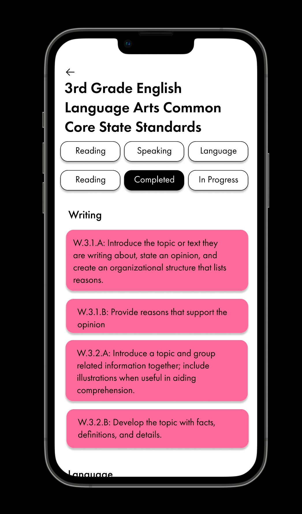
By helping curious children (preK-4th grade) start reaching their reading, written, language, and oral common core standards for their grade level through personalized engaging games that will target an individual's struggles and learning style, this app will help these children reach their full potential!
Research gathered from:
https://hechingerreport.org/proof-points-third-graders-struggling-the-most-to-recover-in-reading-after-the-pandemic/
https://www.bu.edu/articles/2023/how-to-help-kids-become-better-readers/
https://www.nytimes.com/2022/09/01/us/national-test-scores-math-reading-pandemic.html
https://www.edweek.org/teaching-learning/more-than-1-in-3-children-who-started-school-in-the-pandemic-need-intensive-reading-help/2022/02
https://www.education.com/common-core/third-grade/ela/?gclid=CjwKCAjwrdmhBhBBEiwA4Hx5g2g5J8xHaJYY1BLyPjhRvDl9DyGNWmxginyZX-lDyYywguSBubsHihoCF1UQAvD_BwE
Process:
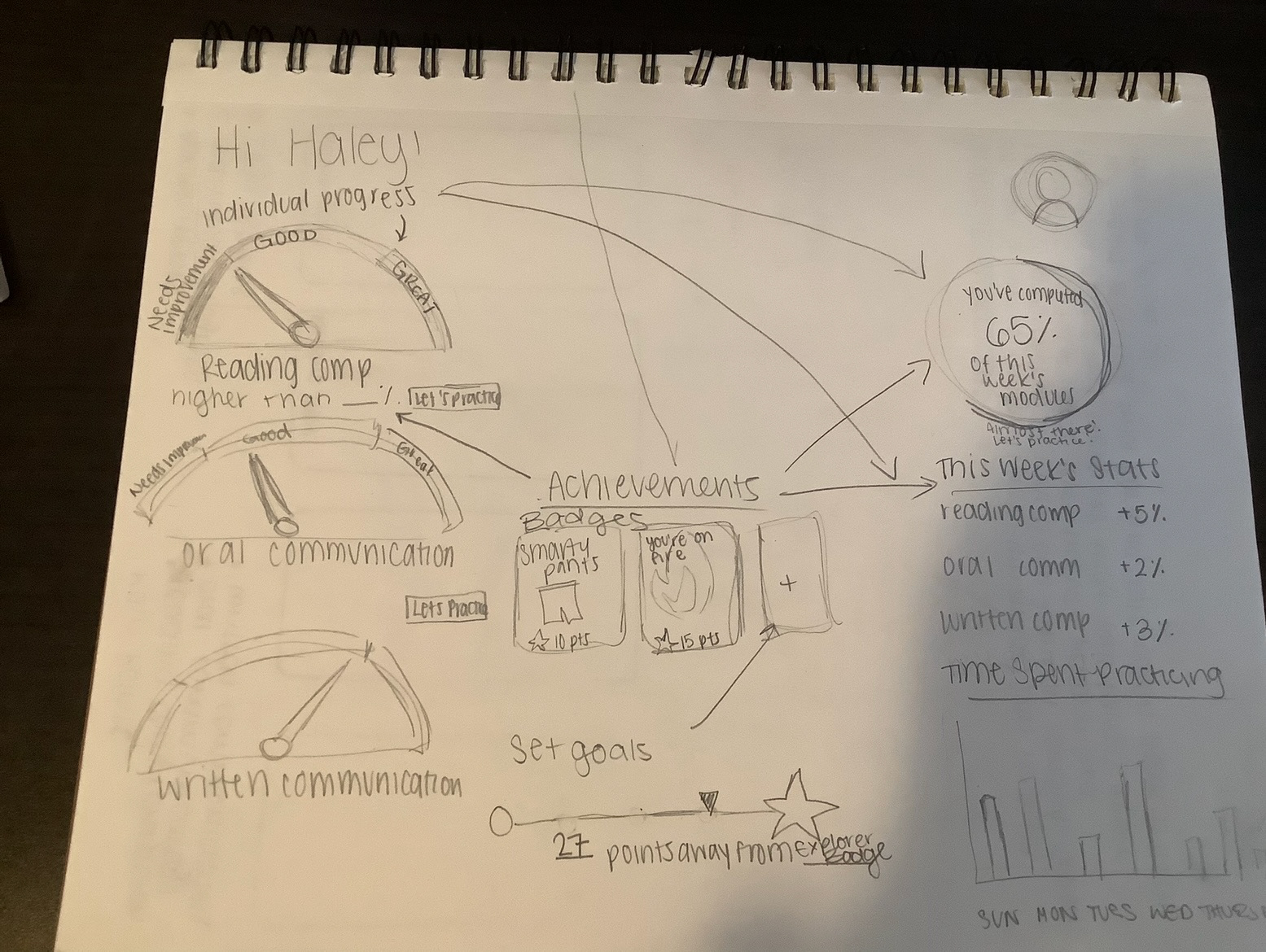
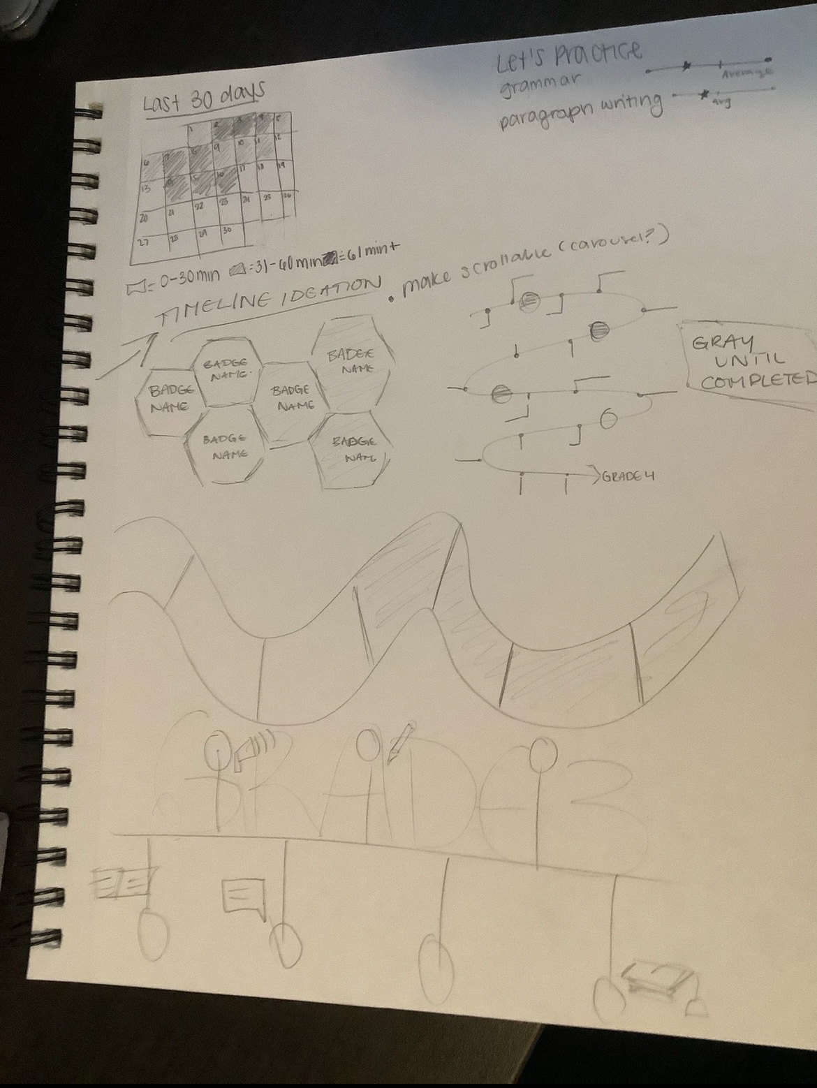
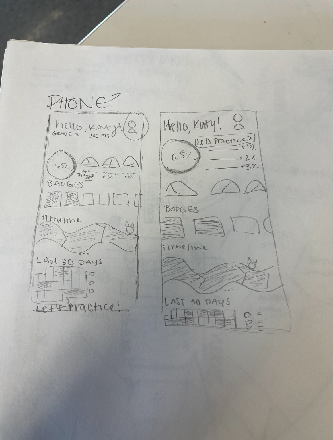
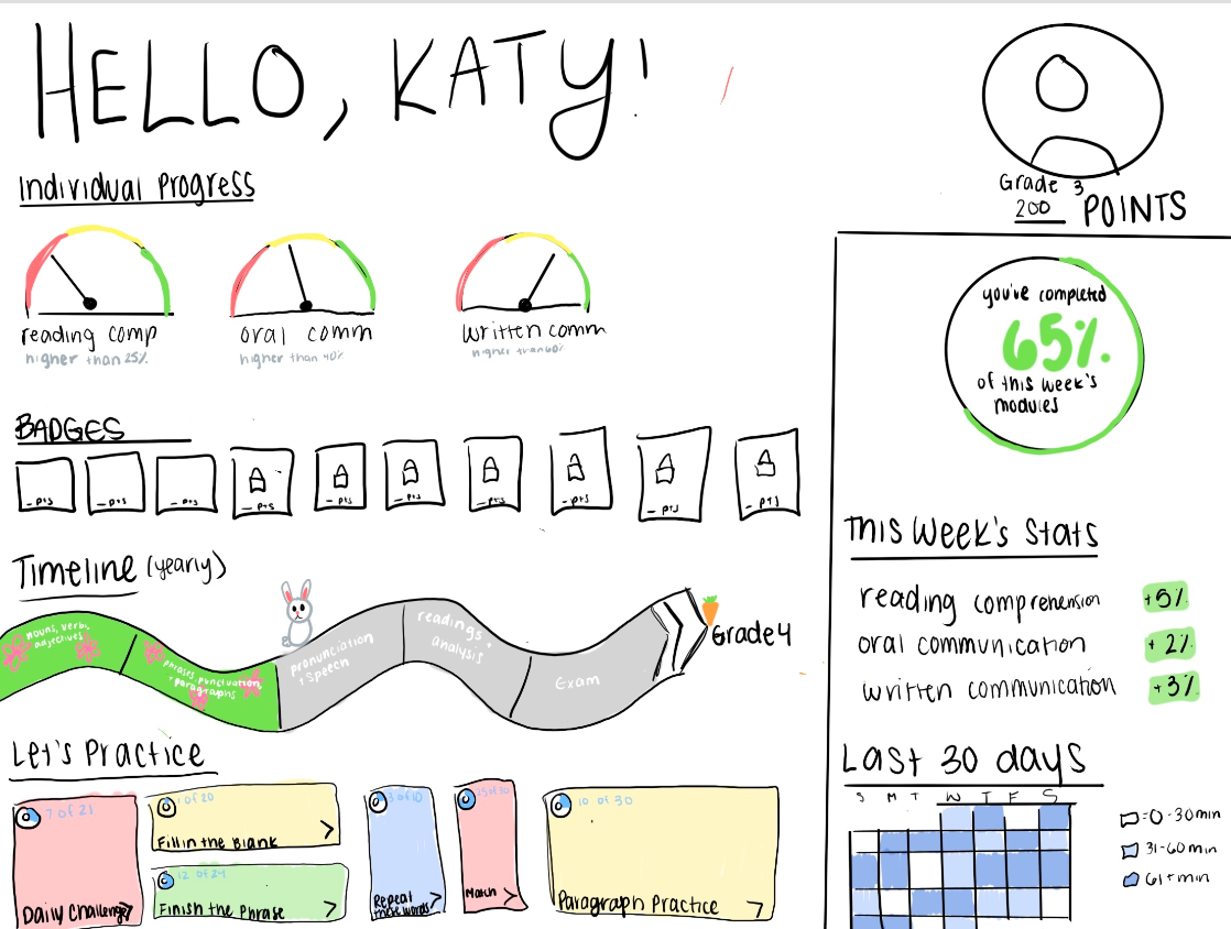
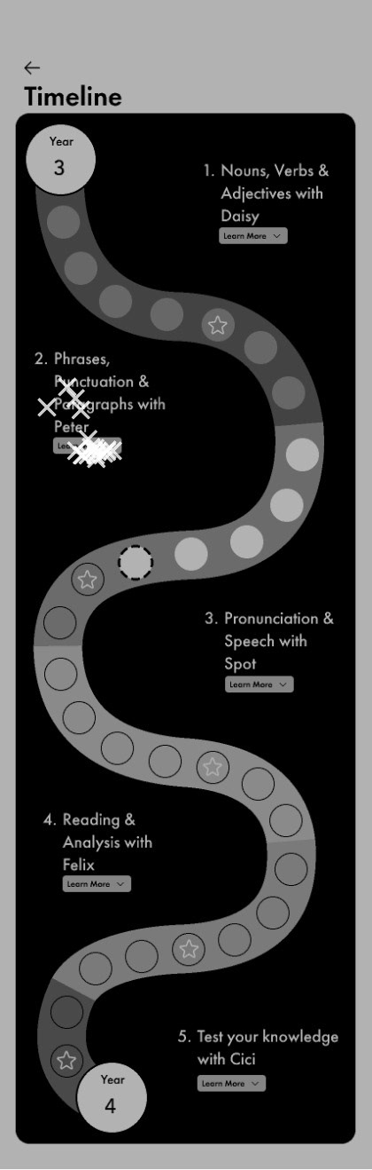
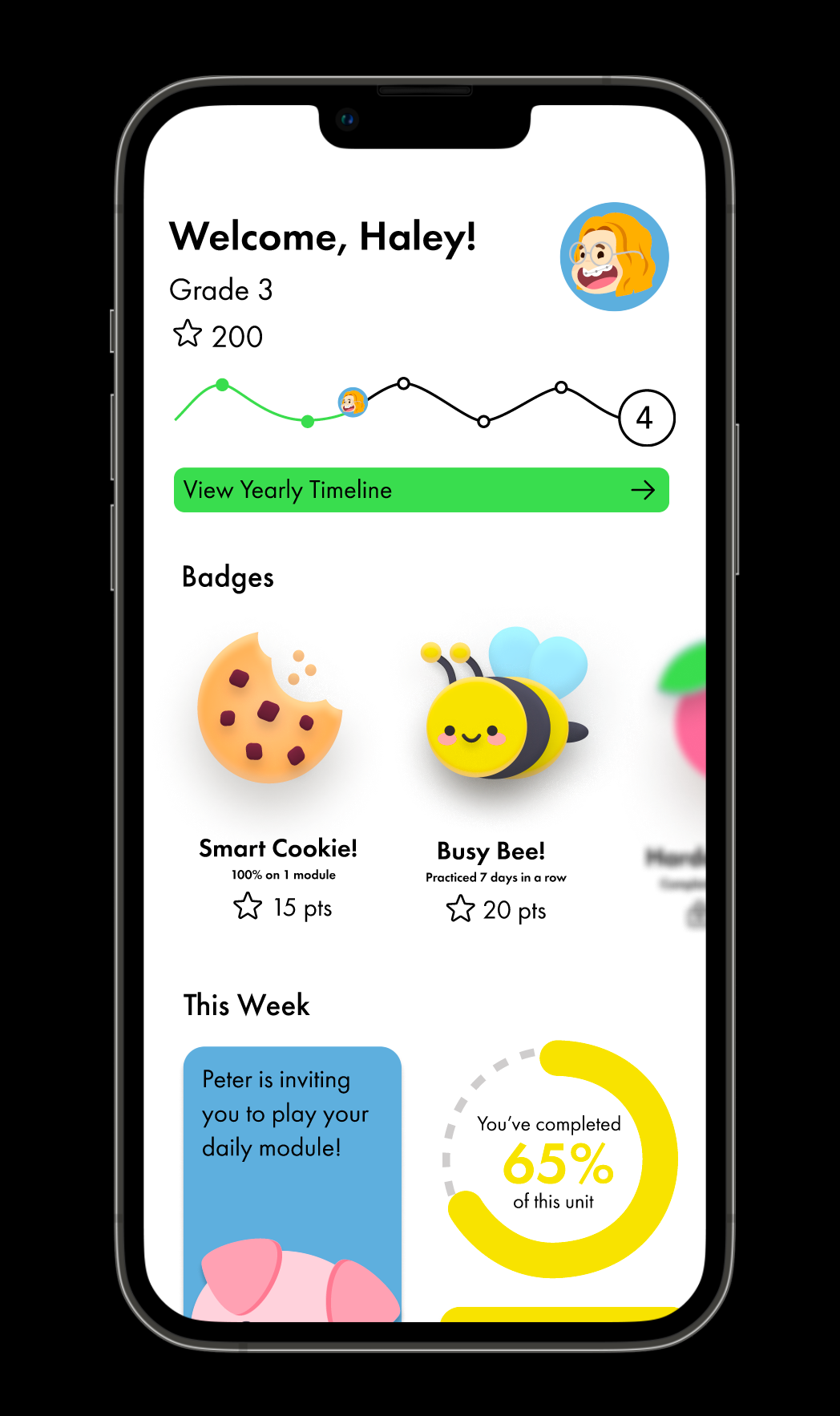
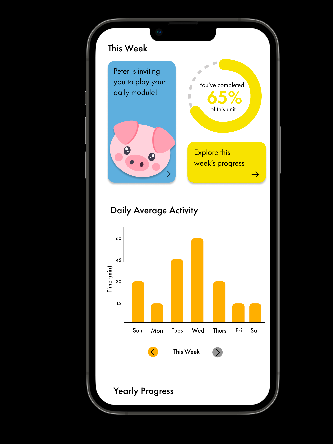
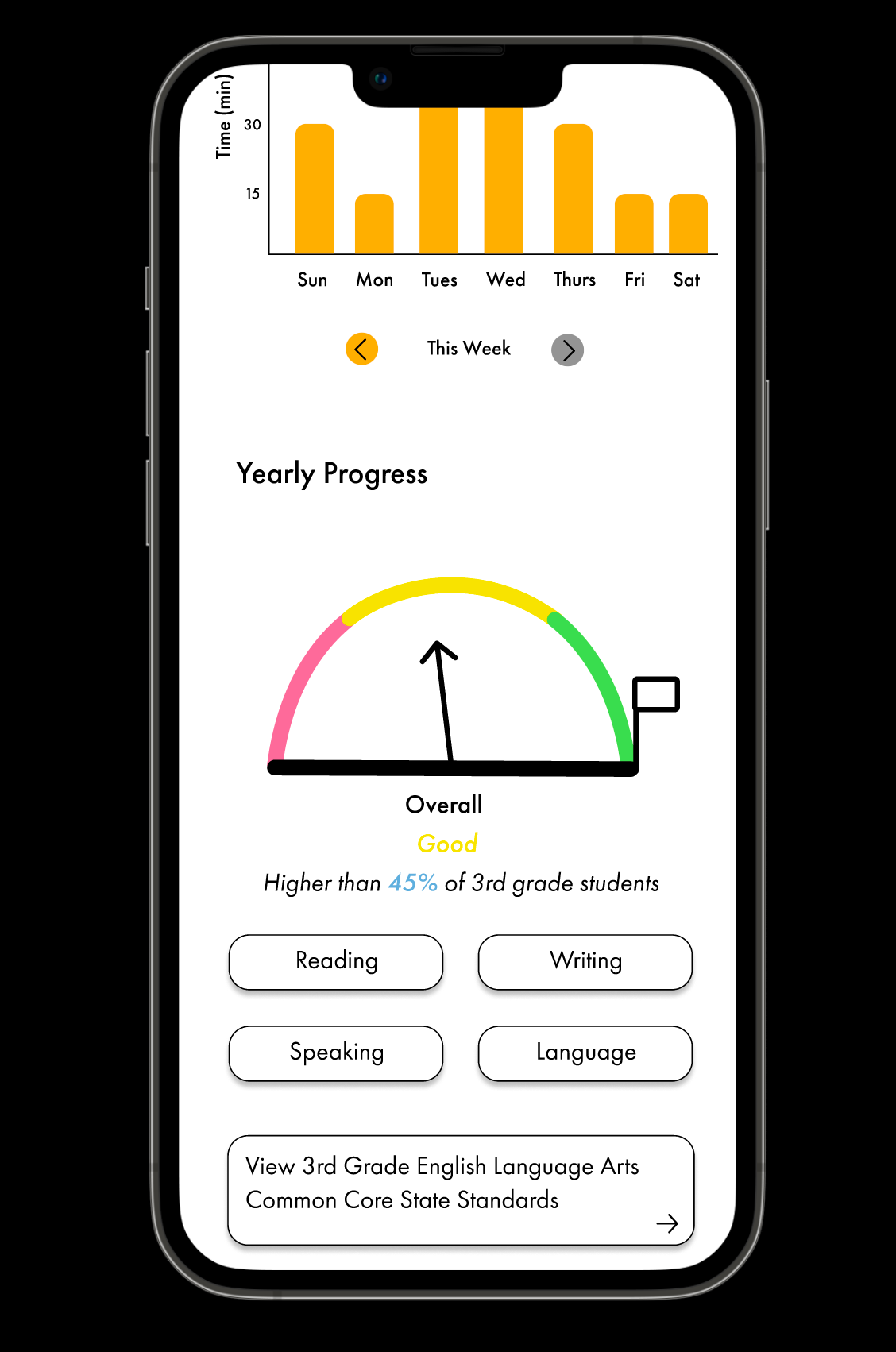
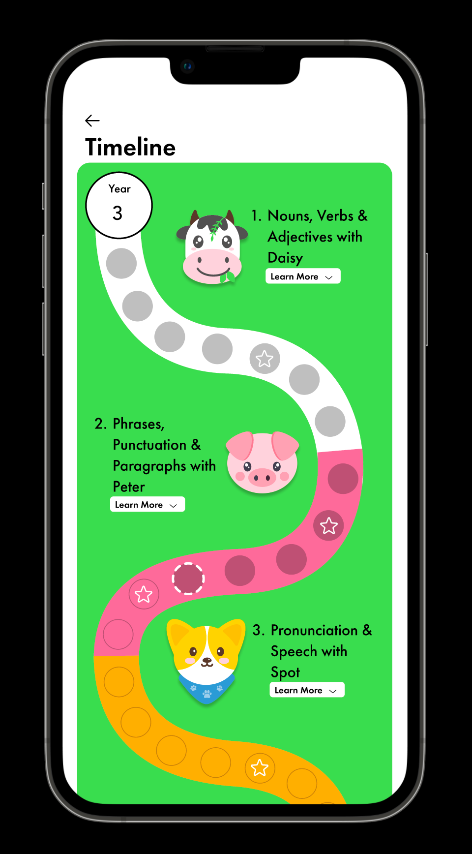
I began this process by first sketching how the data modules could be arranged. I did this originally just with pencil and paper, and then I would later move into Figma to create the wireframes. I identified that the three main data points that I needed to display were achievements, individual progress, and suggestions. I explored different ways that I could display timelines, individual progress, daily time spent, achievements, and practice module suggestions in addition to character drawings.
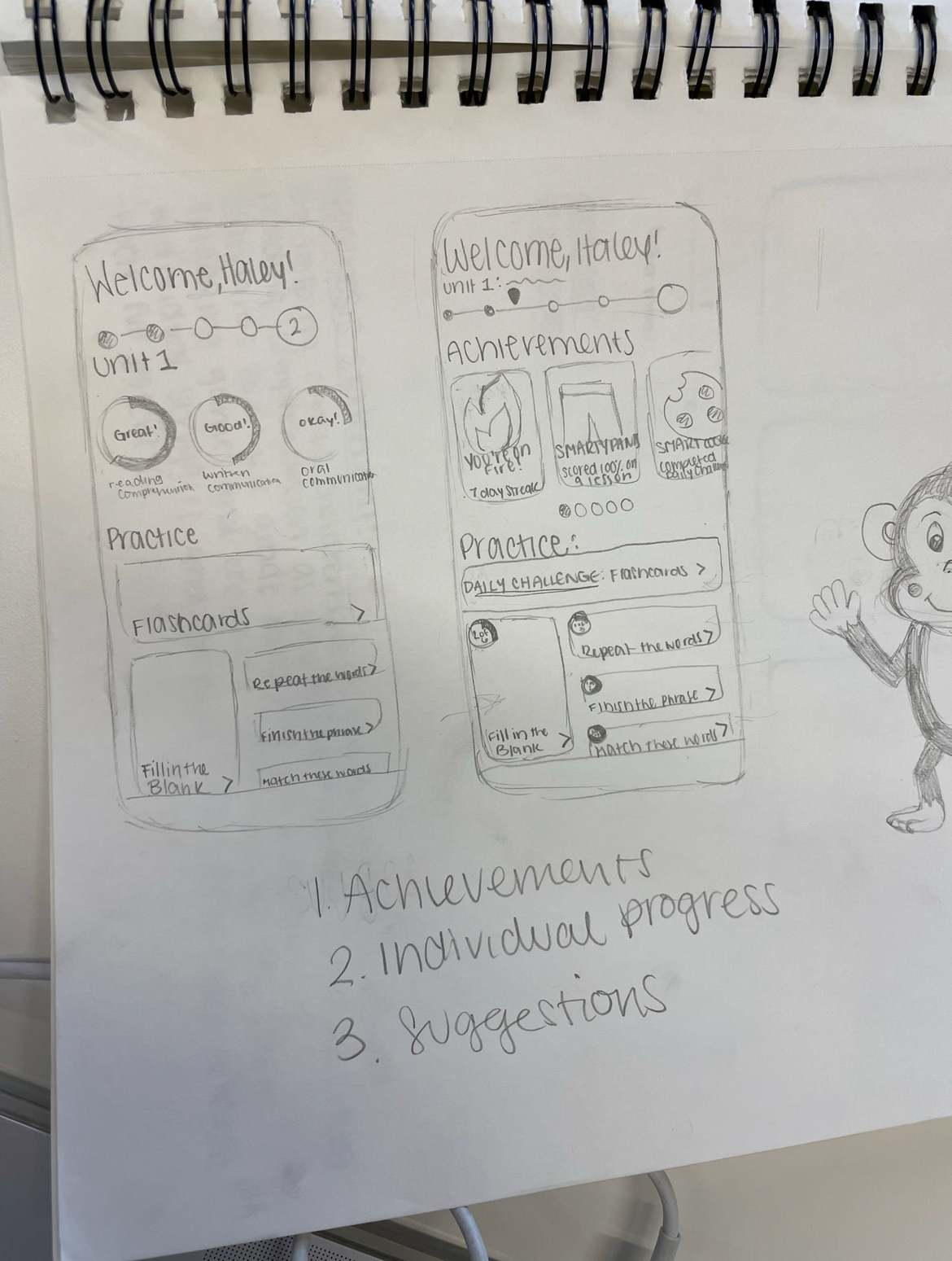
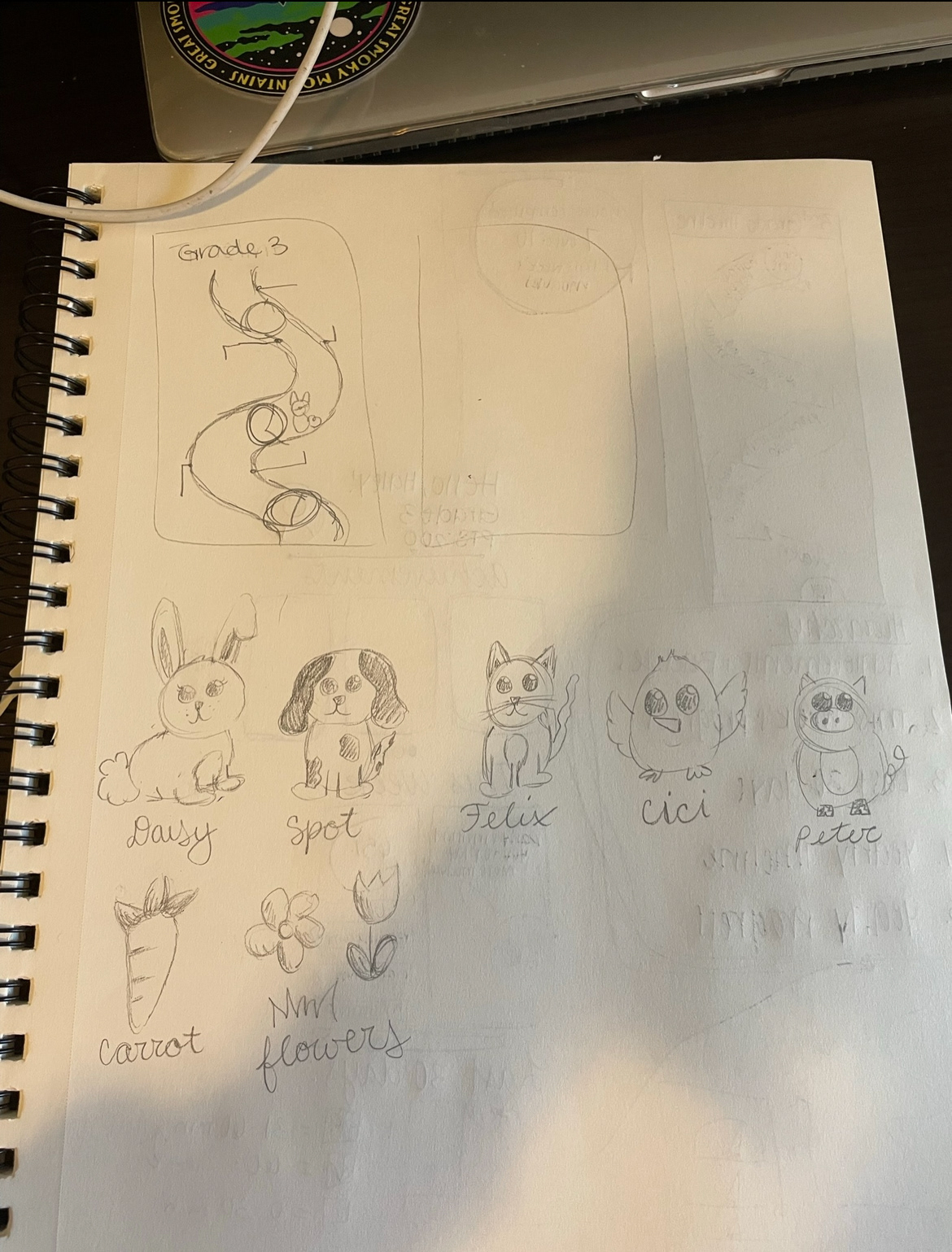
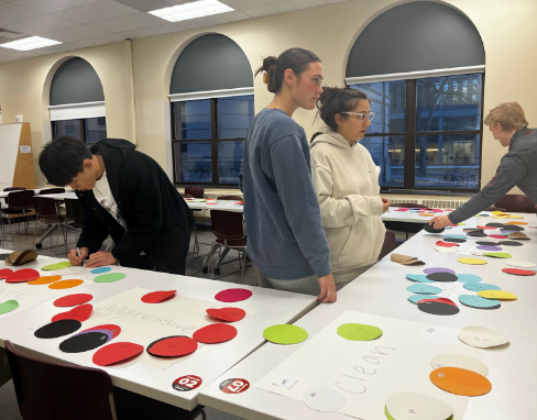
After these hand-drawn sketches, I received feedback from classmates. Some feedback that I received was that I should move the achievement badges higher up in the hierarchy, make the grade level more visible, and think about how the interface will change for each grade. It was also within this discussion that I realized I could expand into multiple wireframes. From there I moved into Figma and started creating wireframes in grayscale. I put my wireframe prototype into Maze for user testing and received a lot of great user feedback. Questions I asked during user testing included:
1. If you wanted to learn more about the timeline, what would you do to get there?
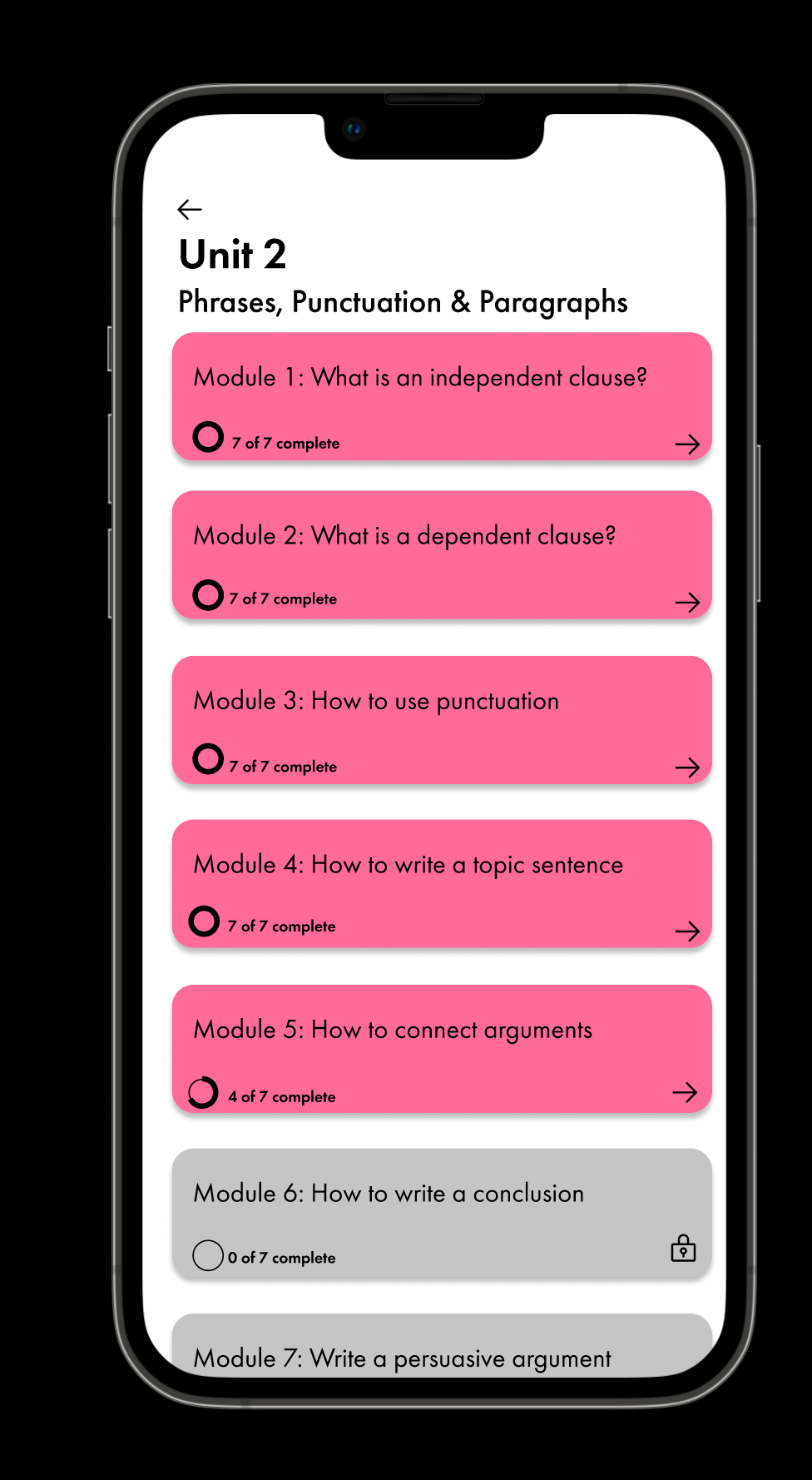
2. If you wanted to explore the modules in Unit 2 where would you click?
3. If you wanted to get back to the home screen where would you click?
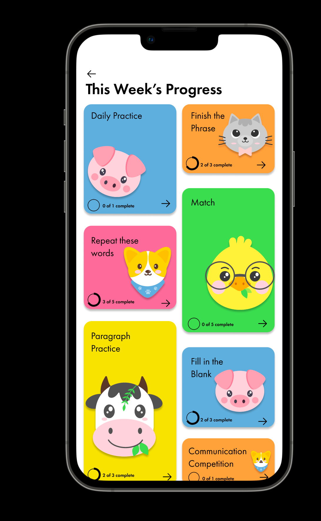
4. If you wanted to learn more about your weekly progress where would you click?
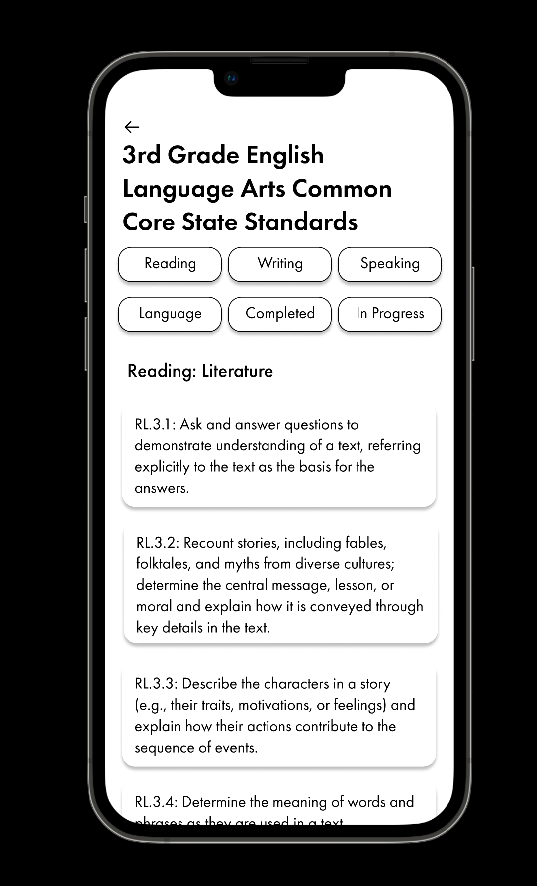
5. Learn more about your reading progress.
6. View your completed Common Core State Standards.
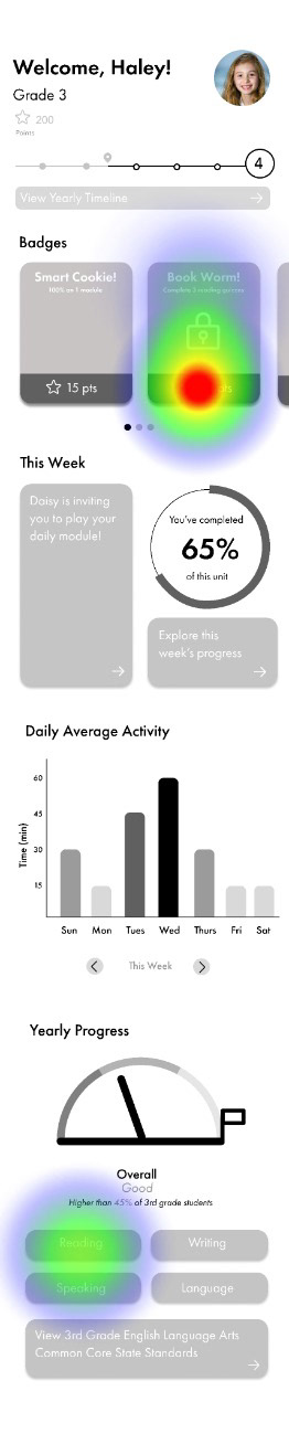
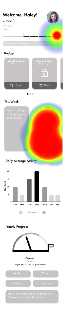
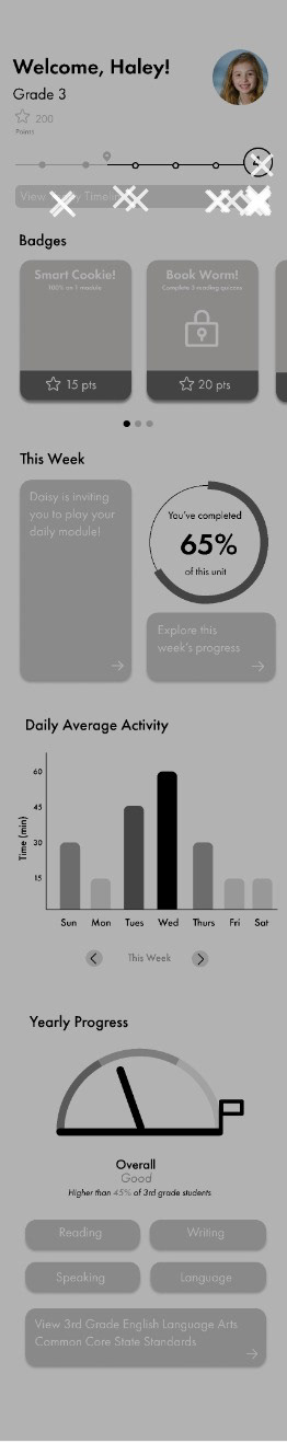
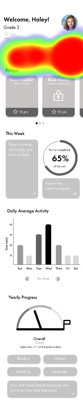
A lot of my design placement choices were validated within user testing, but places to improve were also made clear. For one the closed badges were not understood clearly enough with the lock icon. In addition, it seems most individuals wanted to click on the circular chart rather than the button to explore their weekly progress. I combated this in the future by having both the chart and the button lead users to weekly modules. Finally, many individuals tried clicking the "Book Worm" badge when trying to learn more about their reading progress rather than scrolling to the bottom of the page. This was partially due to the unclear task I gave, but many individuals also came up to me after testing saying they did not know that they could scroll with the testing software.
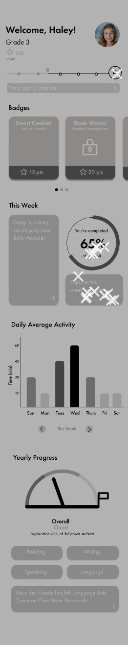
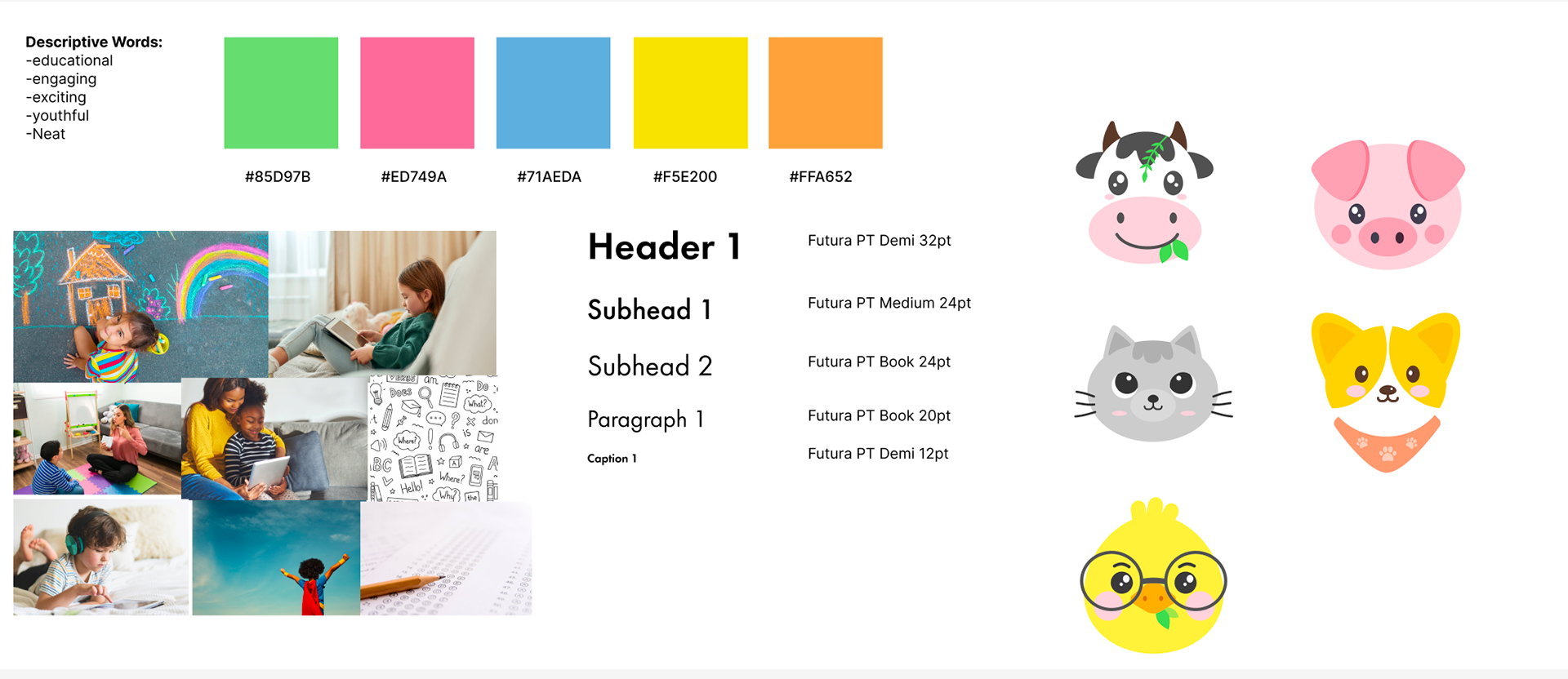
After making these adjustments, I began to create and incorporate a UI style guide. The colors were inspired by chalk and the font (Futura PT) has geometric attributes that make it easy for children to read. In addition, I chose to include animals throughout the dashboard to make children more excited to learn, as it is proven that children are more connected to an app when animals are involved. I originally had all of the text for buttons, modules, and badges in white with bright colors, however after testing the colors for accessibility with a contrast checker, it came to my attention that all of the text would have to be changed to black.
Finally, in the last week of this project, we met with designers from ZOCO in Columbus, OH to go over our designs and receive feedback. One of the main points of feedback that I got from the designers was to mimic the timeline overview on the home page with the wave-like design on the in-depth timeline frame. This proved to be greatly beneficial in tying the frames together. In addition, they recommended that instead of making the locked badges gray, I still find some way to include color. After spending some time experimenting with Figma, I decided to blur the unopened badges.
Final Deliverable:
https://www.figma.com/proto/g9tIL4JAbraDXjjRGfC5do/Behavioral-change?page-id=49%3A629&node-id=121-531&viewport=195%2C3014%2C0.43&scaling=scale-down&starting-point-node-id=121%3A531
Reflection:
This project was one of my favorite projects that I have done at OSU. I have always loved user experience design and the psychology that is involved, however, it was challenging when I had to think about behavioral change from the eyes of a child. My biggest challenge was definitely prototyping. I had many different frames and interactions that I wanted to include. Specifically, the scrolling action of the badges took a lot of fine-tuning, as did the pop-ups of the yearly progress for each section. Overall, I really enjoyed creating this dashboard and user testing, and I can see this expanding into a larger project.