Project Overview
This Design Research project was conducted by four other designers and I. We set out to apply design research methods in order to understand people's experiences. We conducted and analyzed generative design research in order to produce insights and final deliverables. This was a co-design process set to challenge what designers are taught about color. Our driving question was:
Is color theory accurate and inclusive?
Project Goals
Primary Goals:
1. Fully understand how non-designers perceive color
2. Challenge the ideas of color theory to see if they actually promote inclusive designs
Secondary Goals:
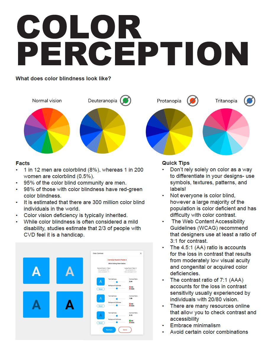
1. Determine how color-blind individuals perceive color differently and the different types of color deficiency
2. Help designers create more inclusive products and environments
Focus & Scope
Focus:
Perception of Color
Scope:
1. Learn how non-designers were taught color theory
2. Learn how designers implement color theory into their designs
3. Learn how color-deficient people have adapted and experience color in society
4. Learn if color-deficient individuals would benefit from inclusive designs
5. Learn about the meanings that colors have personally and culturally
6. Learn how often non-designers think about color in their daily lives
Assumptions & Preconceptions
Assumption 1: Designers' view on color theory is not as accurate as we think. Current designers' perception of color theory is biased and designers typically forget to include people with color deficiencies when designing.
Assumption 2: People with color blindness have a negative relationship with color. They must adapt to function in life.
Assumption 3: All people have their own personal biases and relationship with color.
Preconception 1: Non-design participants may not realize the meanings that they have connected to certain colors.
Preconception 2: Color-blind individuals do not think about their inability of relating to color in their day-to-day lives.
Primary Research Methods
1. Survey
2. Homework
3. Open Conversations
4. Collective Visioning
Secondary Research
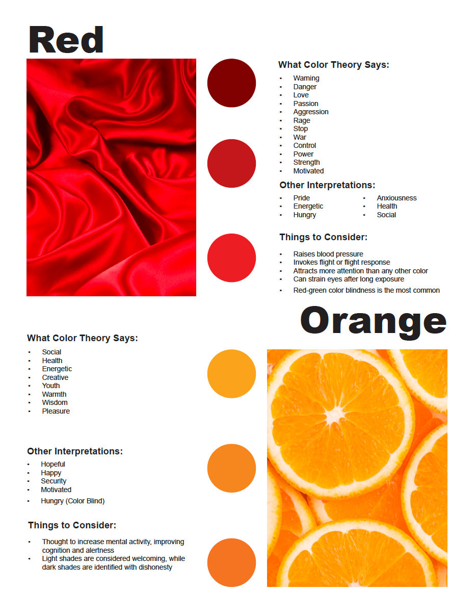
Red is associated with warning, love, courage, aggression, rage, passion, danger, war, death, alertness, power, control, and strength. It attracts more attention than any other color. Red is thought to raise metabolism, respiration rate, and blood pressure.
Orange is associated with wisdom, pleasure, desire, pride, loneliness, and warmth. It is considered a high-energy color and is thought to affect appetite by increasing hunger. It is also thought to increase mental activity, improving cognition and alertness.
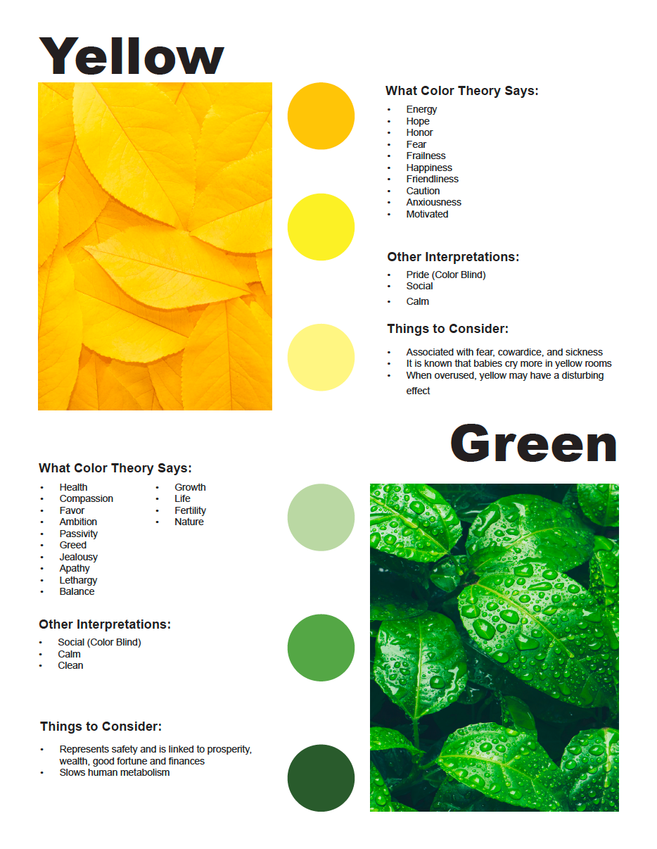
Yellow is associated with energy, hope, honor, fear, frailness, happiness, friendliness, caution, cowardice, and sickness. It is known that babies cry more in yellow rooms and when overused, yellow may have a disturbing effect.
Green is associated with health, compassion, favor, ambition, passivity, greed, jealousy, growth, life, fertility, and nature. It represents balance and is linked to prosperity, wealth, good fortune, and finances. It also slows down human metabolism.
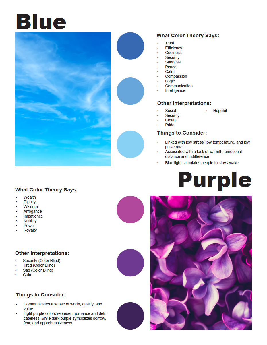
Blue is associated with trust, efficiency, coolness, security, and sadness. It is a symbol of logic, communication, and intelligence. It is linked with low stress, low temperature, and low pulse rate.
Purple is associated with wealth, dignity, wisdom, arrogance, impatience, nobility, power, and royalty. It communicates a sense of worth, quality, and value. Light purple colors represent romance and delicateness, while dark purple symbolizes sorrow, fear, and apprehensiveness.
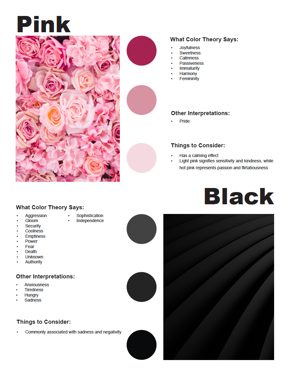
Pink is associated with joyfulness, sweetness, calmness, passiveness, harmony, and immaturity. It has a calming effect and is the color most associated with femininity. Light pink signifies sensitivity and kindness, while hot pink represents passion and flirtatiousness.
Black is associated with aggression, gloom, security, coldness, and emptiness. It is viewed as mysterious in many cultures. It represents power, authority, and sophistication. Black signifies seriousness and independence and is commonly associated with sadness and negativity.
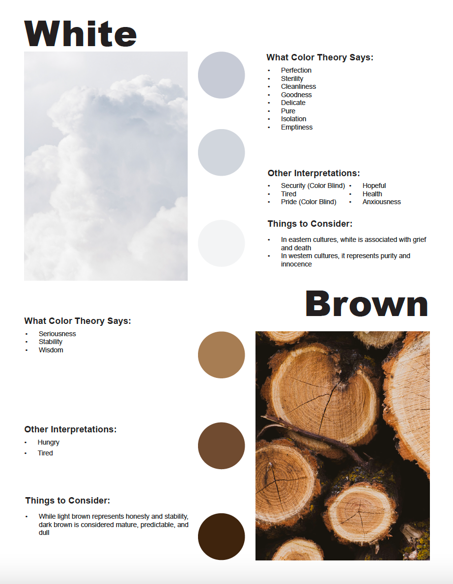
White is associated with perfection, cleanliness, goodness, coldness, delicate, purity, isolation, and emptiness. In eastern cultures, white is associated with grief and death. In western cultures, it represents purity, innocence, and sterility.
Brown is associated with seriousness, stability, and wisdom. While light brown represents honesty and stability, dark brown is considered mature, predictable, and dull.
Co-Designers
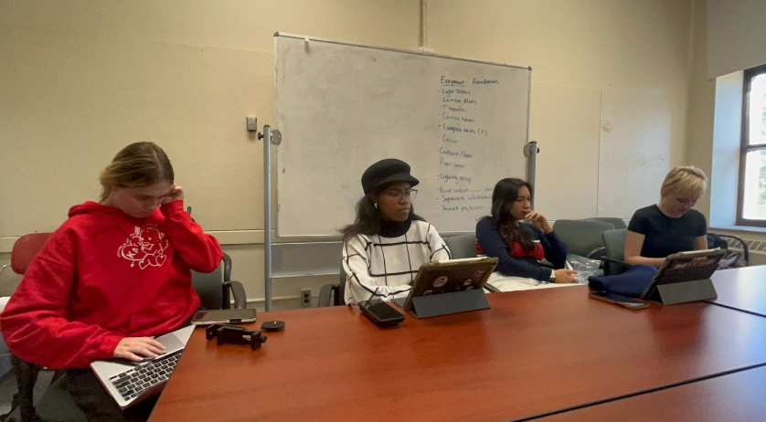
We co-designed with color-blind individuals and non-design OSU students. We recruited participants by word of mouth and posting on social media. All co-designers participated in a series of research activities and worked with us to create a help book. We received 85 responses from OSU students for our survey. We sent out homework digitally to 8 color blind individuals and 8 non-design OSU students. We also conducted in-person and online interviews with 8 color blind individuals, 8 non-design OSU students, and 3 professional designers (1 color-blind). Finally, we conducted an in-person collective dreaming workshop with 8 color blind individuals and 8 non-design OSU students.
Pilot Testing
We completed pilot testing with another group in our class to test our proposed research study before a full-scale research study. We decided that we wanted to test our homework assignment and open conversation questions. Four participants completed the homework assignment which had the prompt "Please take pictures throughout your day whenever you notice that your mood changes". We realized after their homework responses that we needed to make the assignment directions clear so that we could get images more in line with what we wanted. We decided to change the question after this pilot testing to "Take an image every time you go to a new environment and record your emotions". We also asked our peers the questions we would ask professional designers. They thought the questions were insightful when done in a group setting. These questions included:
1. What is your process for deciding on what colors to use in a design?
2. When not restricted to a color palette, how do you go about choosing colors?
3. Of the color theory that you were taught in school, what do you remember and/or still implement in your designs today?
4. Do you ever consider people with color deficiencies when designing?
Survey
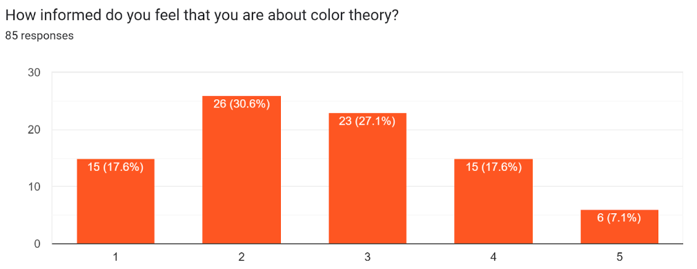
We sent out a survey on social media platforms and through word of mouth and we received 85 participant responses. 14.1% of participants were OSU design students, 85.9% were OSU non-design students, 7.1% were color blind/ color deficient, and 92.9% were not color blind/ color deficient.
We asked the question "How does the color _____ make you feel?"These are the most common answers:
Red- powerful, energetic
Orange- energetic, creative, happy
Yellow- happy, energetic, hopeful
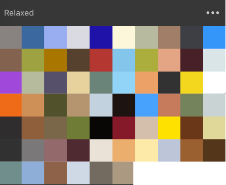
Green- calm, healthy, and wealthy
Blue- calm, sad, clean
Purple- creative, calm, pride
Pink- feminine, creative, happy
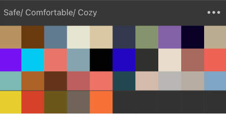
White- clean, calm, health
White- powerful, secure, lonely
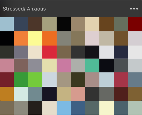
Brown- calm, tired, hungry
Homework
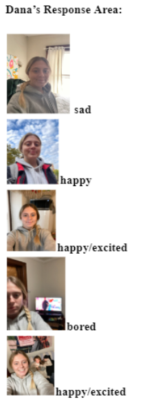
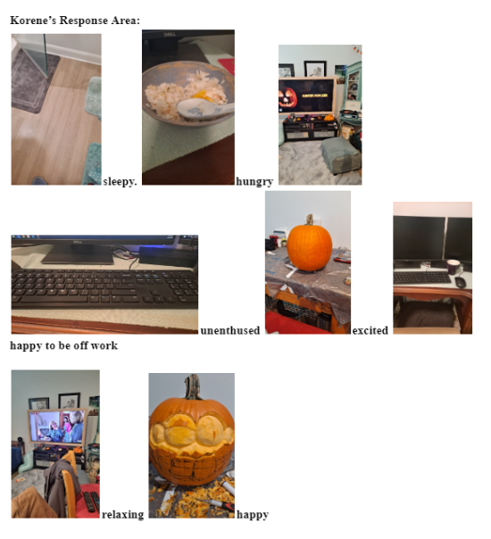
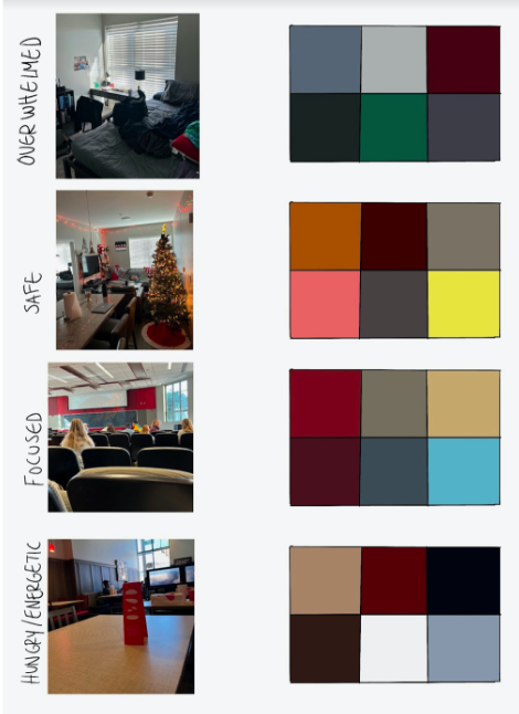
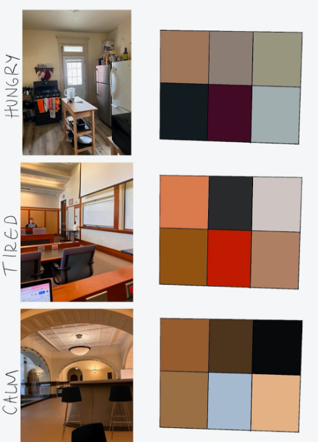
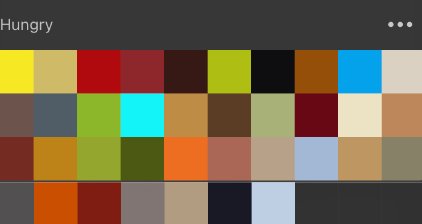
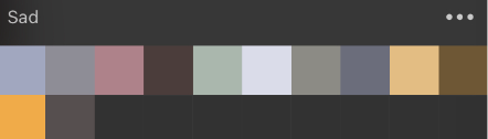
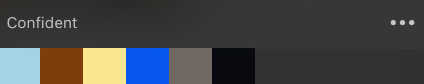
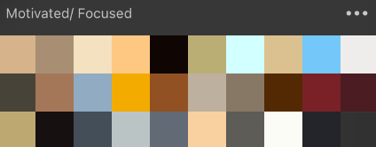
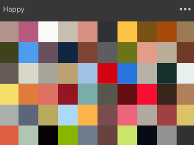
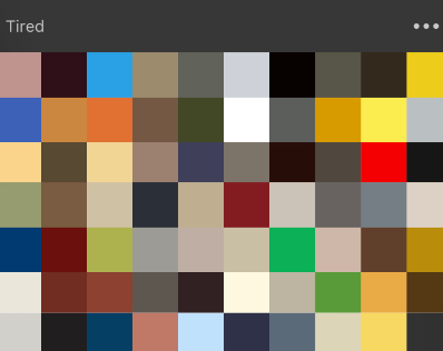
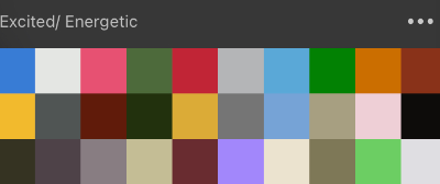
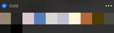
We sent out homework to 8 color blind individuals and 8 non-design OSU students prior to open conversations. We asked the participants to take a picture every time they entered a new environment during the span of a day. We then asked them to upload their images to a Google Doc and add a note to each image describing the emotions they felt at the moment that an image was captured. I spent most of my time analyzing the homework responses. I analyzed their images by importing them into Procreate and pulling the colors from the images. I then created palettes from these colors and compared them with their emotions to see if there is a correlation to color theory. Ultimately we discovered that our data was inconclusive. Correlation does not equal causation and therefore there were many lurking variables that made it difficult to draw any conclusions. Examples of lurking variables, in this case, include the lighting of the images, the amount of sleep and stress of participants, as well as personal preferences.

Open Conversations
In our open conversations with non-designers, we came to the conclusion that all individuals have somehow heard of color theory but have never actually been taught it. All individuals think that color does have some impact on their mood and most of the participants have some positive experiences with color.
Our goal with the open conversation with color-blind individuals was to understand their relationship and experiences with color throughout their life. Three of our participants had red/green color blindness and one had blue/yellow. They were all diagnosed as a child. Some pain points with color that they have had in their lives include stoplights, matching clothing items, picking colors when designing (especially saturation and tint of colors), and often needing someone to help when shopping for clothes. All individuals had a negative relationship at the beginning of their lives, especially in required art classes. All individuals had to learn to adapt to their deficiencies and most had to rely on others to help with color-related decisions. Since they have lived with color deficiency for their entire life, all of the participants now look at color decisions as more of an annoyance.
We also had an open conversation with 2 professional designers, one of which was color-blind. The color-blind individual stated that color at the moment is currently secondary to materials in their designs. They only really implement complementary colors and the balance between warm and cool colors in their designs, whereas the non-color blind designer tends to focus on the relationship and meanings of colors. In terms of considering color-deficient individuals in their designs, both professional designers said they would love to be able to, however, money, time, and client needs take priority.
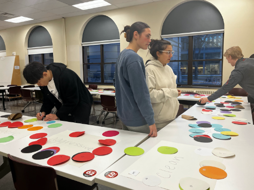
Workshop
The goal of our workshop was to further understand if color theory is actually accurate. We had 8 non-design OSU students and 8 color blind participants. We laid out 15 cards with different emotions written on them. Participants were given a variety of colored post-it notes. They were then asked to place whatever color(s) they felt best went with each emotion. After they placed all of their post-it notes we had them walk through their thought process.
Most of the non-designers answers validated color theory, however, they associated pride with red rather than purple, anxiousness with black rather than yellow, and tiredness with black rather than yellow.
Color-blind individuals had more colors that did not validate color theory. They associated white with security rather than blue, pride with yellow and white rather than purple, and blue with social rather than orange. In addition, they associated orange with being hopeful rather than yellow, black with anxiousness rather than yellow, white with tiredness rather than yellow, and yellow with energy rather than orange.
Similarities between non-designers and color blind:
1. Red- hungry, aggressive
2. Yellow- happy
3. Green- health
4. Blue- sad, calm
5. Black- anxiousness
5. White- clean
Differences between non-designers and color blind:
1. Security- blue vs. white
2. Pride- red vs. yellow and white
3. Social- orange vs. blue
4. Hopeful- yellow vs. orange
5. Tired- black vs. white
6. Motivated- red vs. orange
7. Energetic- orange vs. yellow
Conclusions
1. Color-deficient individuals DO have a different relationship with color than non-deficient individuals. Being color blind affects what emotions they relate to various colors
2. Color theory is NOT entirely correct. It does not account for people's personal experience with color and should be updated.
3. Designers, on average, are not being as inclusive with their designs as they should be with color deficiency. This could largely be attributed to a common lack of knowledge on how to inclusively design with color
Final Deliverable
I was tasked with creating the final co-design deliverable of the reference book for designers. I created this in InDesign and used insights from our data and secondary research. Many of my classmates requested that I send them a PDF version of this document so that they can begin to make more inclusive designs.
Reflections on the Co-Design Process
My personal experience with the co-design process was positive and extremely interesting, I enjoyed working with non-designers and color-deficient individuals. I got to hear a lot of interesting stories which allowed me to empathize more. Some things I would change if I were to conduct this study again were to gather more participants and to edit the homework so there are fewer lurking variables. Obviously, we cannot design for every type of disability or impairment in every situation, but doing research and empathizing with the users is a great step forward. These results can be applied to web design, interior design, and industrial design and can be used to cater to different emotions. Some other questions to consider exploring off on this data include "Are favorite colors influenced by certain life experiences?" and "Are certain personalities drawn to certain colors?"